HTML Essentials in Easy Steps
Code Institute and Mike McGrath
Validate your HTML code against standard rules
Many HTML tags need to be opened and closed.
Between the <html> tags add all the other (child) elements.
Fill in the Blanks with Placeholder Text
Nest an Anchor Element within a Paragraph
Make Dead Link Using the Hash Symbol
The checkbox Type input Element
The select/optgroup/option Elements
The details and summary Elements
description, keywords and author Metadata Types
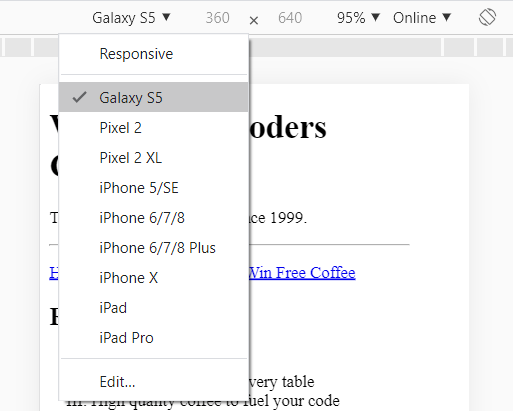
Test your page on different simulated screen sizes:
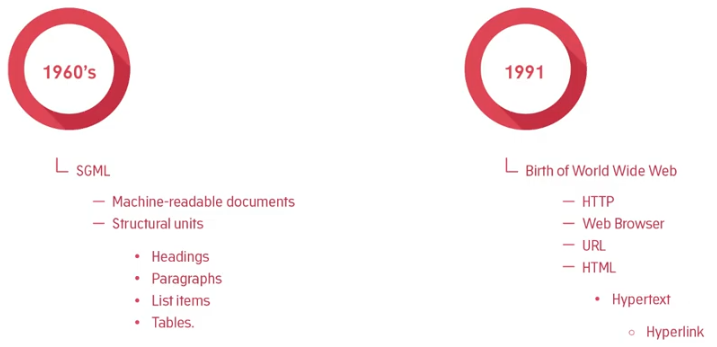
Now before we get into the details of the hypertext markup language, HTML. Let's take a look at how HTML came about and why it has changed the world in a very real way.
In the 1960s, three employees in IBM created the general markup language, GML. Its purpose was to enable the sharing of machine readable large project documents in government, law, and industry. Machine readable means that it could be understood by a computer. Now the GML, later standardized as the SGML, allowed electronic documents to be arranged into structural units such as headings, paragraphs, list items, and tables. But what the SGML did not include was hypertext.
Fast forward a couple of decades, in the late 1980s and still today, the European laboratory for particle physics in Geneva, known as CERN, was a meeting place for physicists from all over the world where highly abstract and conceptual thinkers engage in the contemplation of complex atomic phenomena, that occur on a minuscule scale in time and space. The results of such thinking produced research projects. Often, there was overlap between project ideas, breakthroughs in one area of research could potentially accelerate progress in another. Research was also undertaken in collaboration with institutes all over the world. And these research projects needed to be documented. Further, the documents needed to be shared.
A certain employee by the name of Tim Berners-Lee was working in one of the computing services sections at that time. And he had the idea of enabling researchers from remote sites across the world to organize and pull together information. But instead of simply making available a vast number of research documents as files that can be downloaded to individual computers. He suggested that you could actually link the text in the files themselves, in other words, there could be cross references from one research paper to another. This would mean that while reading one research paper you could quickly display part of another paper that contained directly relevant text or diagrams. Documentation of a scientific and mathematical nature would be represented as a web of information held in electronic form on computers across the world. Berners-Lee thought this could be done by using some form of
hypertext, some way of linking documents together by using buttons or links on the screen, which he just clicked on to jump from one paper to another.
As it happened, Tim had been working on his own document and text processing project called Inquirer since 1980. Now the concept of hypertext had been around since the 1940s and early Apple computers and applications that had applications that could link documents together. But only on the same machine, you couldn't link across a network. Figuring out how to make jumps to computers on the other side of the world had yet to be cracked.
But in 1991, Berners-Lee demonstrated a basic but attractive way of publishing text by developing some software himself and also developing his own simple network protocol. By the way a protocol is a set of rules for communicating between computers across a network. This protocol allowed for retrieving other documents via the hypertext links. The protocol known as HTTP stands for HyperText Transfer Protocol. The text form format for traveling along HTTP was named HTML which stood for the Hypertext Markup Language, term hypertext.
HTML was based on the SGML and consisted of just a few tags or elements. These tags are special characters added to an electronic document that designates some of the same structural units as the HTML but in addition to the SGML, HTML had included a hyperlink tag. Berners-Lee also built the very first web browser to receive and display those link documents. To receive a document you needed the address of the computer where that document was stored, along with the name of the document, this became known as what was called the URL, the Uniform
Resource Locator. Software running on the URL location was called a web server. Now the web server listened for requests for a particular document, when a request came in the web server would return or serve the document back to the machine that had requested it. So the requesting machine was called the client and the serving machine was called the server.
Along with some others who recognized the potential of his work, Berners-Lee looked to magazine and print media for guidance as to what structural elements would be most useful for this project. And he kept things very simple, just a few tags were required to learn and add to a document. He also encouraged others to build upon his ideas and design further software for displaying HTML and also for setting up their own HTML documents ready for access. So the revolution had begun. Pretty soon other institutions began creating and linking these documents, and in doing so, the web of existing material out there on the internet grew. Hobbyists and universities got in on the act, a community group, people figured out how to display images on a web document, more tags were added to increase the structural features of a document. And within 5 years the web had exploded in size and complexity.
So let's look at the anatomy of a web page.
HTML uses elements to structure your content. These elements can be created in any text editor, that's the beauty of it. And you save your documents with a .html extension when saving, so that a browser will recognize them as such.
Browsers are coded to recognize the elements included in the document and will attempt to display the content as intended. The elements act as instructions to the browser, they say things like
And no matter how complex or sophisticated today's web applications are, at the heart of say Facebook and YouTube there lies this simple structure. Web documents will call them pages from now on, created in 1991 still work perfectly in the most modern of web browsers.
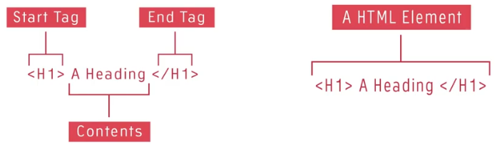
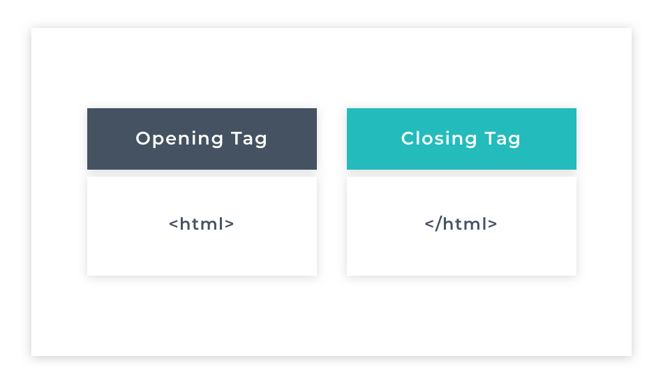
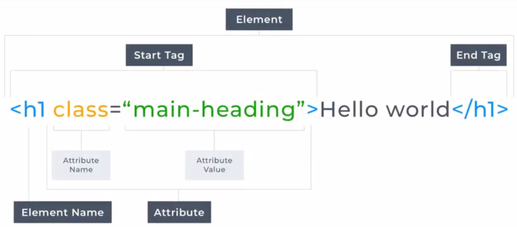
So what does an element look like? Well an element generally consists of an opening tag. Which is made up of some characters wrapped inside an angle brackets, as you can see here. The text to be structured known as the contents follows the back of the brackets and then it's completed with a closing tag which looks just like the opening tag but has a forward slash inside the angle brackets. In our example, we are shown an element that's used to
display text as something important, in a newspaper this would be a headline, in a research document this would be the title, as it would also be in a blog post.
So how does the browser know this? Well the browser is created to look for and recognize these tags. The tags act as instructions to the browser as to how to format the contents. The h1 characters inside the angular brackets of the opening tag say to the browser, until you're told otherwise all content after my right-hand angle bracket, is to be displayed in big bold text. The browser says ok and prepares to display the content as big and bold. As the browser reads the content from left to right it will eventually come across the closing tag. This closing tag says to the browser we're done here. No more big and bold text required in this element. The browser will continue scanning any other elements in the document until it sees a special closing tag. The closing tag is the special HTML tag with a forward slash in it. Then it will display or render the structural elements that are encountered during the scan.
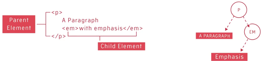
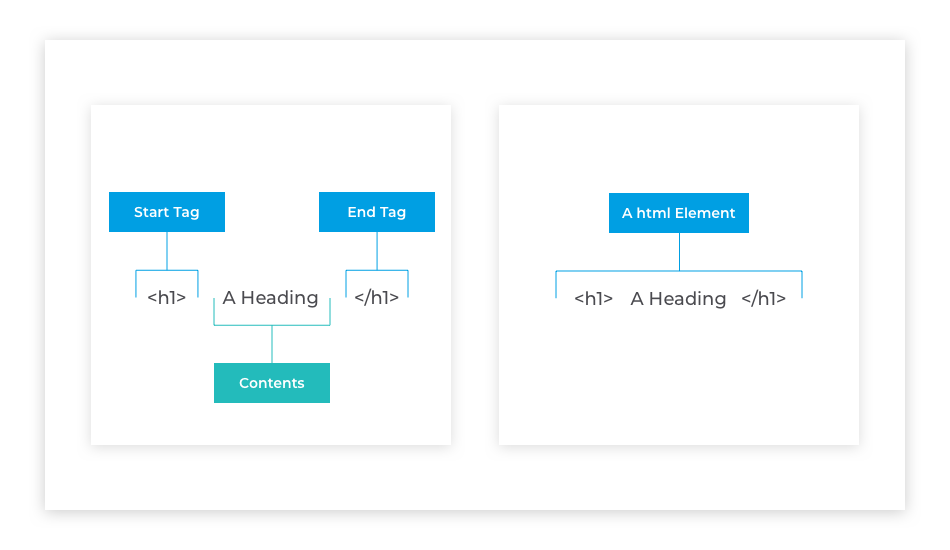
Elements can contain text but they can also contain other elements. In the example shown here, we would say the paragraph element contains the emphasis element. Or we can say that the emphasis element is a child of the paragraph element. People refer to this as a child parent relationship or nested relationship. Any element that contains other elements is said to be the parent of those other elements. Those contained elements are called its children.
Now the elements form a tree structure like a family tree. The tree structure is called Document Object Model or DOM, for short.
Behind the scenes the browser sees all page elements as objects, and these objects have properties like font size, font family, background color, height, width, and much, much more. Languages like CSS, JavaScript, can access and manipulate these objects to create something dynamic and interactive. The paragraph element has two children. The first is the text, a paragraph, the second is an emphasis element, the emphasis element has one child. That is the text it contains.
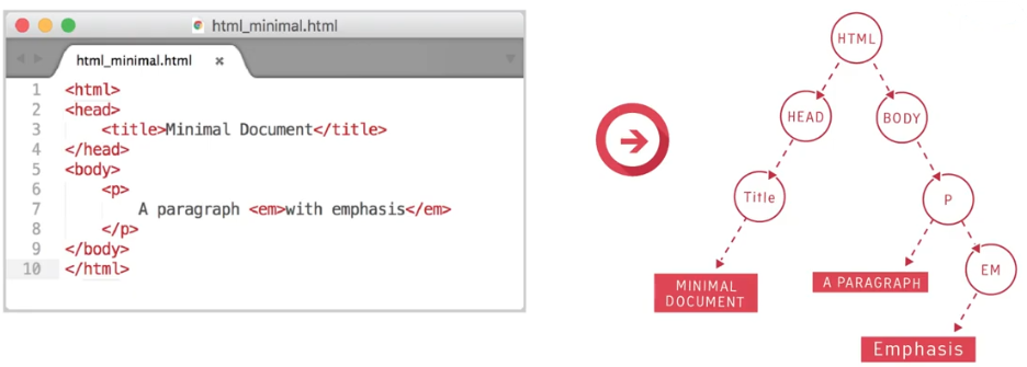
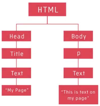
A minimal HTML document can be created out of the fragment we've just seen by adding three necessary elements and a title. The first necessary element is called as the HTML element. This is the parent of all other elements.
We recognize this due to being the outermost element in the nested structure. The HTML element represents the document object in the DOM, it's the parent object of all the HTML elements on a page. The HTML element contains two necessary immediate children. Namely, the head element, and the body element. The body element generally contains tags that are used to lay content on the screen. But the head element contains tags that provide supporting information, such as the title of the page, and other links.
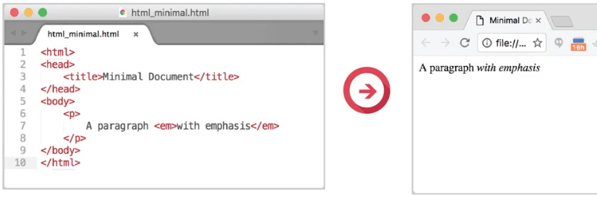
In our example shown here, the page title is displayed not in the main browser viewing window but in a browser tab. Links to resources such as externally hosted fonts that are used by the page are also often added as children of the
head element. Note though, that these links aren't clicked on to activate them, but the browser will automatically send a request to where they're located and add them to the page so they can be used.
The Markup Validation Service is a validator by the World Wide Web Consortium that allows Internet users to check HTML and XHTML documents for well-formed markup. Markup validation is an important step towards ensuring the technical quality of web pages.
This validator checks the markup validity of Web documents in HTML https://validator.w3.org/
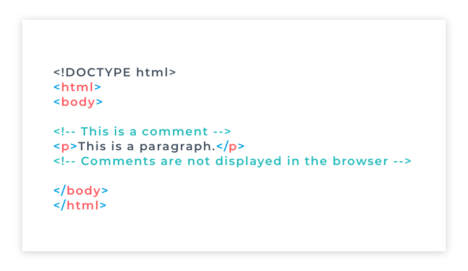
Comments are used to highlight the purpose or function of some HTML structure.
It is a special set of characters that allow you to leave notes or instructions within your web document that is not seen in the browser. It represents textual notation within HTML markup. Comments are represented in HTML as content between <!-- and -->
<!-- This is a single line comment -->
Single line comments have their opening and closing tags on the same line as the text. When comments go over 2 or more lines, the industry standard is to place the comment tags on their own lines, above and below the text.
<!--
When we have more to say than can comfortably fit on one line, we use a multi-line comment.
The convention for a multi-line comment is to put the opening and closing tags of the
comment on their own lines above and below the text.
-->
Comments are important for documenting code and adding notes. They are not HTML elements and will not be visible on the web page.
So when should you use comments in your HTML? A useful approach is to add them to the opening and closing points of large nested chunks of code. That way, you know where the parent container begins and finishes.
Comments come in handy when modifying your HTML later, or when you are trying to find and fix errors (bugs). Commenting is particularly useful if you are trying to figure out what is causing an error in your code – as you can temporarily comment out (i.e. make dormant) the HTML elements. Then you can test your code in small sections to isolate the error.
Comments are essential for explaining to yourself - and any other developers who will work with the code - why you have done certain things. It will save you and your future teammates a lot of time if you leave an easy to understand comment with the code you wrote explaining what it does.
Combining HTML with CSS and JavaScript allows you to produce content that is only limited by your imagination! You can add elements such as images, text, links, forms, video and much more.
Web development is based upon three main coding languages: HTML, CSS and JavaScript
Hypertext Markup Language (HTML) – HTML is a language that specifies the structure of a webpage. HTML documents are plain text documents structured with elements. Elements are surrounded by matching opening and closing tags, and each tag begins and ends with angle brackets < >. HTML is the structure of the Web.
Cascading Stylesheets (CSS) – CSS is a language used to add styling to web pages. It allows you to alter the font, colour, size, and spacing of your content, split it into multiple columns, or add animations and other decorative features. CSS is the look of the Web.
JavaScript – JavaScript is a language that allows you to add interactivity to web pages. For example, JavaScript is used to display timely content updates, interactive maps, animated 2D/3D graphics, or scrolling video jukeboxes. JavaScript is the logic of the Web.
HTML is solely made up of elements and their attributes. That’s it. Nothing more. For now, think of elements as words wrapped in < > brackets that tell the browser how to display content.
Every HTML element consists of tags. There are two types of tags: An opening tag is written using less-than and greater-than brackets that wrap around the element type like this: <element_type>. An opening tag defines the beginning of the element and can have HTML attributes such as href or style. You'll become very familiar with HTML attributes as you go through this module.
A closing tag represents the end of the element. The closing tag is identical to the opening tag except for the inclusion of a forward slash immediately after the opening bracket </element_type>.
A closing tag cannot have attributes. If the element has content, its opening tag has to be closed. The content of the element is written between the opening and closing tag, and it is this part of the element that will be displayed on the web page. Not all tags need to be closed. Some that don't have any content are known as self-closing tags. We'll talk about those later.
When an element is nested inside another element, its opening and closing tags are indented with an extra tab to the right than the containing elements’ tags. Indenting your html elements this way makes it much easier to visualize where elements open and close because when an element’s opening and closing tags are on separate lines, they should always be indented by the same amount of tabs. Meaning the opening and closing tags should be directly above and below each other.
Mixing up the order of opening and closing tags can cause many issues with the layout of your page, especially when you start working with CSS. Getting into the habit of indenting your elements in this early stage of learning to code will make it much easier to spot when you have made a mistake later on.
An element defines the structure and content of the web page. As we explained earlier, most HTML elements consist of an opening tag, content, and a closing tag. However, some elements are self-closing because they can't hold any content.
Examples of self-closing tags are <img>, which is an element to display an image and cannot also contain text, <br> which provides a line break in text elements, and <hr> which creates a horizontal line for a topic break.
Self-closing elements only have one tag, as they can't contain any other elements there is no need to close them later in the code. You will sometimes see a forward slash at the end of this tag like this: <img/>. This forward slash was needed in earlier versions of html, though it is redundant in html5.
All elements have what are called attributes, and the attributes are always contained in the opening tag. Attributes are additional properties of an element. In the example below, you can see it uses an src attribute. This attribute supplies the image to be displayed.
<img src="picture.jpg">
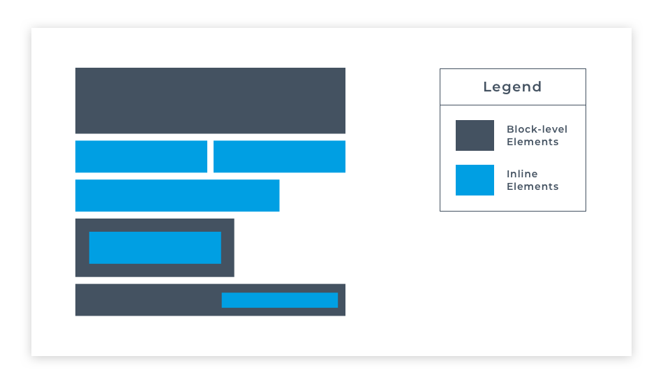
HTML elements are usually either block-level elements or inline elements. A block-level element occupies the entire space of its parent element (container), thereby creating a block. Browsers typically display the block-level element with a new line both before and after the element. They have a rectangular structure. By default, these elements will span the entire width of its parent element, so it won't allow any other element to occupy the same horizontal space as itself.
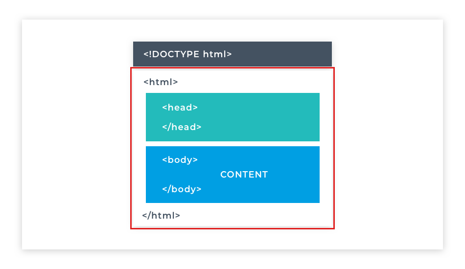
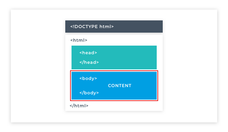
The first thing in every HTML document should be the <!DOCTYPE html> declaration, because it tells the browser the version of HTML to expect in the current document. In this case, HTML version 5 (abbreviated to HTML5) is used. It is not an HTML tag, but it is placed above the opening HTML tag as the first thing included in the HTML file. A page can have only one DOCTYPE declaration. When you view the page in a browser, the declaration is not visible.
All HTML files need to follow the same basic structure: this consists of a <!DOCTYPE html> declaration and the primary elements. The first of these is the <html> element. Nested inside the html element are the <head> and <body> elements. Each of these primary elements, as well as the declaration, can be used only once per page. Take a close look at the image that demonstrates their structure.
All HTML documents are plain text files saved with the .html extension. They can be edited with any text editor and run in any browser.
As a rule, just remember that every HTML document has the HTML element at the outermost level, and in between the <html> and </html> tags is where the <head> and <body> elements go. In between the <body> and </body> tags is the body of the HTML ... that's where everything else will go: images, text, videos, anything you can imagine!
Let's look at some common HTML events.
There are three necessary elements namely HTML, body, and head, that can be only used once in a page. That's because they provide the base structure, but most other elements can be used multiple times on a page and there are a few elements that show up in nearly every web page created. So let's take a look at some of them here.
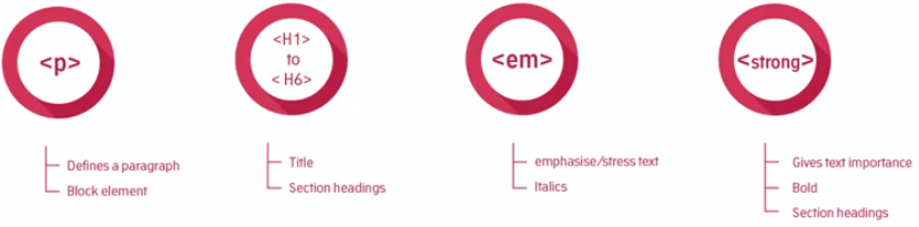
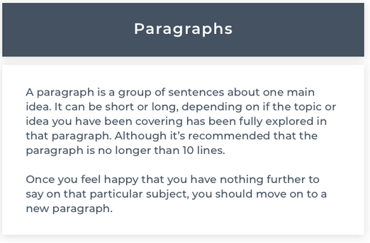
The p element is one of the most common elements and as you might have guessed it defines a paragraph. As with print media a paragraph creates a line break below it to visually separate from other paragraphs. This is used to emphasize a semantic separation of content. The same structure is used in a novel or a magazine.
Elements that create spacing below themselves are called block elements. Block elements appear vertically down the left-hand side of a page, at least until they're styled by CSS.
Paragraphs and headings work in concert to create the majority of the text content of a web page and its structure.
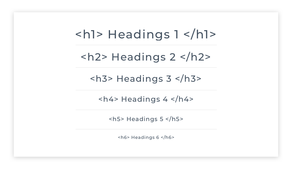
Now HTML has six heading elements which are numbered 1 through 6. H1 is the most significant and usually contains the title of the content, not to be confused with the title that appears in the browser tab, I mentioned earlier.
H2 represents a subsection, H3 and so on represent identifiers of further subsections until we get to H6.
Headings are also block elements.
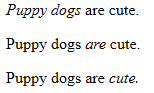
Inline elements are elements that don't cause a line break below their display. Take the examples shown, there's an emphasis tag and a strong tag for italicizing or emphasizing and making something bold. Now the reason why they
don't introduce a line break below, is that you may want to emphasize or make bold some text within a paragraph in order to stress particular words or phrases. And you'll most often not want to add a line break below the stressed text. Just as you wouldn't when writing a regular document in Microsoft Word or similar.
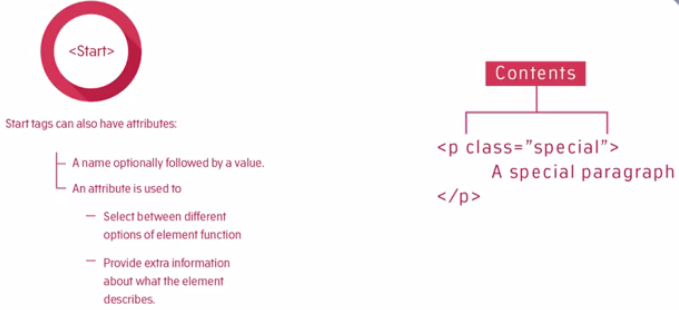
Element start tags can also have attributes. An attribute is composed of the attribute name, optionally followed by a value.Now an attribute is used to select between different options of an element function or to provide extra information about what that element does. Take examples of attributes, like in element <link rel="stylesheet" href="stylesheet.css">. In this case, the attributes are rel and href, and their values are in quotes after the = signs. We'll see later how CSS targets these attributes in order to style the elements.
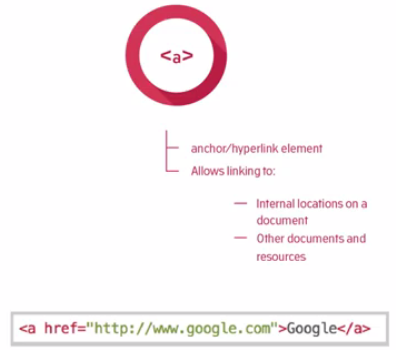
Some elements need to have at least one attribute to be of any use. The famous hyperlink element, also known as the a element (anchor), has an attribute that contains the address of the HTML resource that it links to. In HTML content links that are supposed to be interacted with you are the anchor elements. The anchor element defines an anchor or a specific part of a page that can be linked to and a link article somewhere so it needs an address.
So to use the anchor element as a link to another page we use the href attribute, which will hold the address of where it needs to go to. The href attribute has as its value the location of the page or resource we'd like to link to. In the example shown here, the link when clicked, will take us to google.com and in particular Google's default or home page.
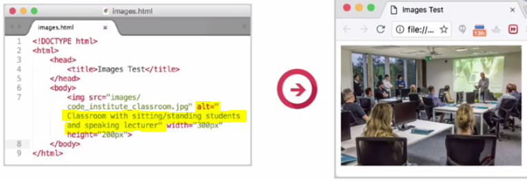
The img element is used to define an image on a page. We use the source attribute to link to an image either on our server or somewhere else on the web.
The image also has an alt attribute. It's also considered best practice to include an alt attribute value on any images you use, because the alt attribute will display any text within the attribute, if the image doesn't load or if a vision impaired user is using a screen reader to visit your site. The screen reader will read the alt tag so put a description of the image you're adding in this attribute.
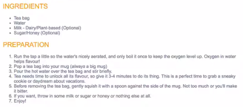
Another common textual feature is a list. Lists can be divided into two types, ordered and unordered. Unordered list displays as bullet points, the order of the bullet points is deemed unimportant. An example might be a list of ingredients in a recipe.
If the order of list items is important then we use an ordered list. By default the ordered list will display in numerical order with the first item numbered 1, second 2, and so on. But these can be customized to use letters or even Roman numerals. An example of the use of an ordered list might be the preparation of the steps required for the recipe.
Lists can also be nested within each other. Nested lists are good match for the sections and subsections of a
website.
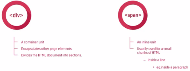
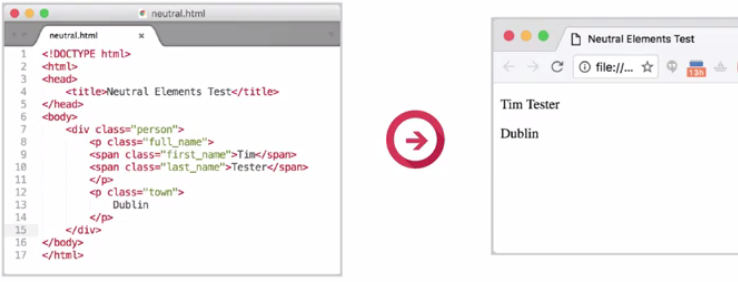
Neutral elements such as a div and a span are also included. Not everything can be marked up as semantically as a paragraph or as emphasized text. Sometimes an element is needed to group other elements or to allow other information to be attached to a part of a document.
Div and span are intentionally, semantically neutral. That is they don't mean anything in themselves other than helping to identify structural areas on a page, but they can be given meaning through the use of CSS, which we'll see later.
In the image here, we open the <html> directly beneath the <!DOCTYPE html> declaration. We close the html element at the very end of the page by repeating the tag, but this time with a / before the tag name, like this: </html> This tells the browser that the element is closed and, in the case of </html>, that we are at the end of the web page.
The html element can have a lang attribute. This attribute is used to identify the language of text content on the web document using this syntax: lang="en-US". The lang attribute tells the browser which language the page is written in. English, for example, has the ISO language code en and if you want to be specific on what dialect of English is used you can append a county code such as en-US for American English.
When writing HTML code, it is always a good idea to create your closing tag immediately after creating your opening tag. That way you won’t forget to do it later. Many code editors will add it automatically for you
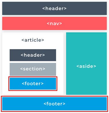
The <html> element tells the browser that the current document is a HTML document. This element contains the entire web page. It’s a container for all the other elements and is defined by its opening <html> and closing </html> tags. The html element is also known as the root element. This element has two directly contained (child) elements namely; <head> and <body>.
You’ll see as you move through the course that concepts like containment and parent/child, ancestor/descendant relationships play a big part in how HTML is structured. But for now just notice that the outermost tag <html> and its closing counterpart </html> contain (are placed outside) all the other html elements.
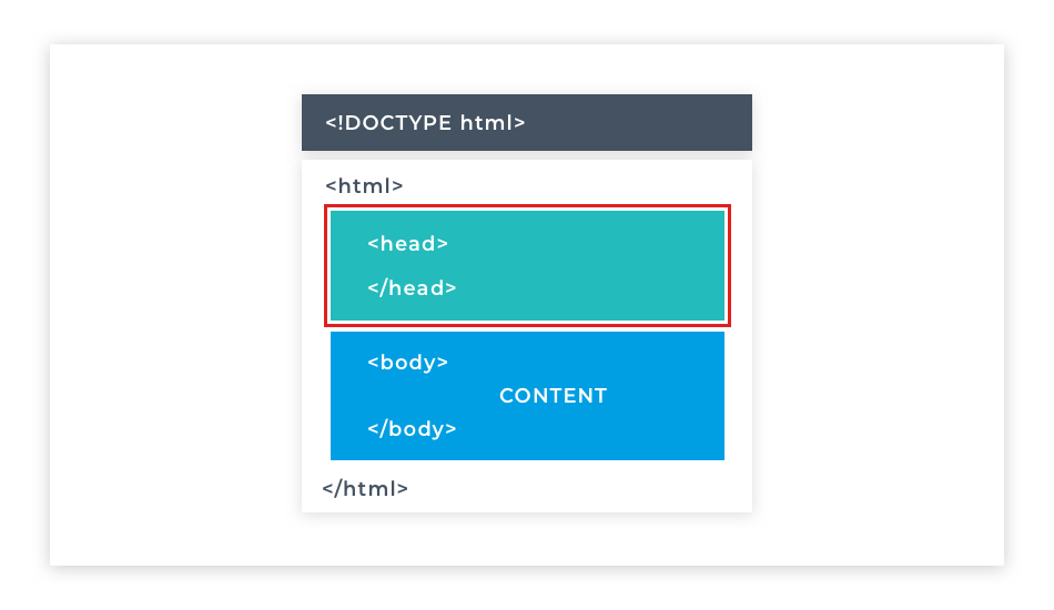
The <head> element contains metadata about the page and links to external resources such as Cascading Style Sheets (CSS) and JavaScript files. This element is the first child of the <html> element. It holds all the information about the page that is not displayed in the browser.
Metadata – is data that describes other data. For example, it can specify who wrote the document, and provide a list of keywords and phrases used in the document. We will discuss metadata in more detail in a later section of this module.
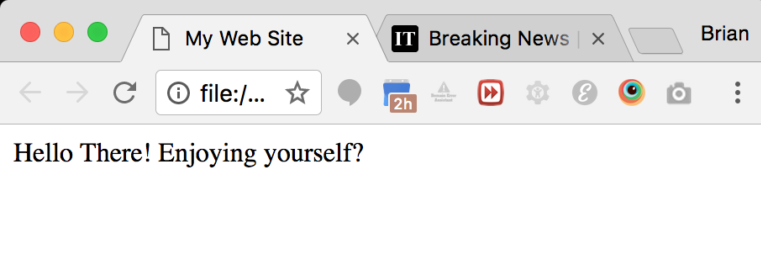
The <title> element is contained (nested) inside the <head> element. It displays the document title. This title will appear in the browser tab rather than on the main browser window. Nothing listed within the <head> element directly appears on the main browser screen.
The purpose of the <title> element is to identify your page within a bunch of other browser tabs. The Repl.it live code editor won’t display the title for us, so take a look at the next image to see what a typical title looks like in a web browser. You can see that the title "My Web Site" appears in the browser tab.
The <body> element uses any local or external CSS and JavaScript included in the <head> element to apply logic and styling to itself and its contents. Any visible web page content is created within the opening and closing <body> tags. The <body> element is the only sibling of the <head> so it is also a first descendant of the <html> element. It's created immediately below the <head> element.
The <body> element contains the visible parts of the web document (page). Everything that a user sees on the page lives inside the <body>. Therefore, all of the page's content will be added within the <body> tags.
Content can include images, paragraphs, headings, links, forms, tables, lists. We'll get to play with all of these as we go through the course.
In this section, we will look at HTML elements for text.
Text is an integral part of any website and while we could write our text directly into the body element like this. And have it appear on the screen, as you can see it appears as one big block of text with no structure making it extremely hard to read. Fortunately, there are HTML elements we can use to structure the text on our web pages into headings and paragraphs. The text on a web page needs structure to be readable. Headings provide signposts to different topics and sections of the content on the page. Users can scan headings to find what they're looking for quickly and text broken up into paragraphs is easier to read. There are six heading elements to choose from. Each starting with an H, and numbered 1 to 6. The heading levels decrease in size and importance, heading tags have a top-down hierarchy from h1 to h6. They establish a hierarchy of importance starting from the largest h1, and on down through h2, h3, h4, h5, to the smallest h6.
The most commonly used HTML element for text is the paragraph element which represents a paragraph of text. It can be used to break up large amounts of content into smaller, more readable sections. By default, the content of a paragraph element will always start on a new line with a space above and below it.
Using headings and paragraphs together we can begin to structure the content of a webpage in a readable and usable way such as the structure of a blog post or newspaper article.
The headings on a web page have the same role as headings in a newspaper. Along with images, headings are the first elements noticed on a web page. There are six different headings in HTML.
Heading tags have a top-down hierarchy from <h1> to <h6>. They establish a hierarchy of importance, starting from the largest <h1> and on down <h2> <h3> <h4> <h5> to the smallest <h6>.
Headings are bold text by default. There should be only one <h1> element per page, while other headings can be used multiple times per page. They should follow the hierarchy of importance. Headings should be used semantically and should not be used to make the text bigger or bolder.
Heading levels should not be skipped. That means that a web page should include a <h3> element only if a <h2> element has also been used. Consequently <h3> should also not be used on the web page before a <h2> was used.
Heading elements change the size of their text content, with <h1> being the largest font and <h6> being the smallest. Headings not only give a web page a visual structure, but they create a programmatic structure too - allowing screen-readers for visually impaired users an easy way to scan the sections of a page. Search engines like Google give the text contained within headings more weight when looking for relevant search results, so they are also important for Search Engine Optimization (SEO).
Use a paragraph to:
The <p> element represents a paragraph of text. The text is easier to understand when it is split up into units. For example, a book may have chapters with headings. Under each heading, there will be one or more paragraphs.
Paragraphs are represented in web browsers as blocks of text that are separated from adjacent blocks by a blank space. Paragraphs are block-level elements. A block-level element occupies the entire space of its parent container, thereby creating a "block." By default, block-level elements begin on new lines.
If you want to start a new line within a paragraph element, you can use the <br> tag, which represents a line break in your text content. The <br> tag is a self-closing tag because it cannot contain any content. Therefore it does not have a closing tag.
Web developers traditionally use lorem ipsum text as placeholder text. The lorem ipsum text is randomly scraped from a famous passage by Cicero of Ancient Rome. Lorem ipsum text has been used as placeholder text by typesetters since the 16th century, and this tradition continues on the web. Well, 5 centuries is long enough.
Here is a web page to generate this type of text https://www.lipsum.com/
<p>Lorem ipsum dolor sit amet, consectetur adipiscing elit. Ut nec pellentesque est. Curabitur lacinia rutrum massa, vitae porta turpis convallis non. Proin maximus neque non tellus hendrerit, cursus porttitor turpis malesuada. Integer non maximus lacus. Nulla enim est, feugiat ac elit vitae, euismod placerat ex. Nulla luctus velit ac augue ultrices, nec accumsan nulla facilisis. Proin a pharetra risus. Pellentesque habitant morbi tristique senectus et netus et malesuada fames ac turpis egestas. Donec quis eros viverra, egestas lorem et, gravida magna. Quisque vel erat urna. Aenean a commodo eros, at commodo tellus.</p>
HTML can apply meaning to elements in the way that both the end-user and the browser can understand. For example, h1 represents a document heading. The P element represents a paragraph of text. As a result, these elements have a semantic aspect to them. Semantically subjective elements were developed even further with HTML5 which is currently the newest version of HTML.
Semantic HTML elements make it easier for search engines like Google to distinguish key information in headings or in the main content for their search results. Semantic HTML also provides additional functionality for the user and greater accessibility for users with impairments such as those who use screen readers to access the web. For now the important thing to remember about semantic HTML elements is that they are used to add meaning to content.
However, there are many times when we need to use HTML elements to control the structure of our content on the page where no semantic meaning is needed. Thankfully, there are two elements in particular called div and span that apply no direct meaning to their content.
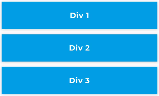
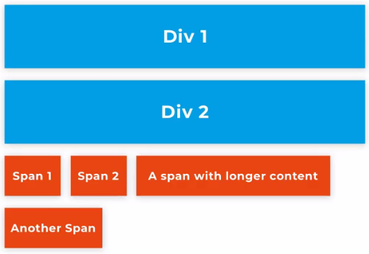
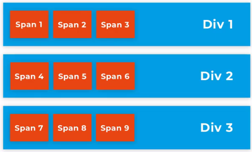
A div element is what is called a block level element. Block level elements will spread the full width of the page by default. Meaning if you define two div elements one after another they will stack on top of each other. Div is short for division. A div divides the page vertically into sections.
A span element is what is known as an inline element. Inline elements only take up as much width as their content and they will share their horizontal space with other inline elements. Spans only move to a new line when there is no more room for them on the current line they are on. Like when typing a word document when the line of words reaches its maximum width next word typed moves to a new line.
Because <div> and <span> provide no context they are what are called semantically neutral elements. They are also known as structural elements. It means that they are used to represent divisions (div) or areas on a document’s layout. We can also specify areas (spans) within these divisions.
As div and span are structural elements they are used in combination with other elements so that both structure and semantic value can be provided in a webpage.
You've already seen heading and paragraph elements nested inside the body element; many other HTML elements can be nested inside one another too. Here we see spans nested inside divs. You can think of divs and spans as building blocks, a way to build a framework for the rest of your elements and content.
HTML can apply meaning to elements in a manner that both the end-user and the browser understand in a defined way. For example <h1> represents a document heading, <p> represents a paragraph of text. These elements have a semantic aspect to them. For example, <h1> can only contain text and displays the content in bold at a particular font size. These combine to highlight the reason for a document's existence. But <div> or <span> can contain any content and context.
By default, a <div> will not share horizontal space with another element. So when you place two in your code one after the other, they will each spread the full width of their container. Therefore they will stack one on top of the other.
As you become more comfortable with HTML, you'll find that a common pattern for designing web pages is using divs to layout their different sections. For example, you might have a <div> containing all your header content, a <div> containing all the main content, and a <div> containing all the footer content. The main itself could then be divided into different sections using nested divs which you could use to separate different portions logically.
The span element is a generic inline container for phrasing your text content. Like a <div>, a <span> doesn’t inherently represent anything, it's semantically neutral.
A <span> element is used for small chunks of text or other smaller parts of a page to group elements for styling purposes. <span> is an inline element, so it does not start on a new line, and it only takes up as much width and height as its content. Unlike <div> elements, you cannot change the width and height of <span> elements.
We can place any element beside a <span> element. Spans can be nested inside divs, but not vice versa. A Web page will not crash if a <div> is nested in a <span>, but it is bad practice to do so. Avoid putting block-level elements inside inline elements.
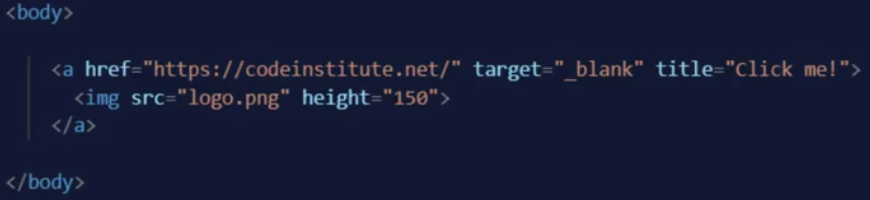
Now you have learned a little about HTML elements, it's time to introduce you to the other essential part of HTML, HTML attributes. HTML attributes are pieces of code that give an HTML element extra customizable properties beyond the standard ones that come with the element type itself. Attributes apply a vast range of different properties and behaviors to their elements depending on which ones are used and which values they're given. In this example, we have an anchor element that defines a clickable link and an image element nested inside it that can be clicked.
We will go into much more detail about these specific elements and their attributes in coming lessons but for now let's take a quick look at these attributes here and what they can do.
The anchor element here contains three attributes. The href is the URL the user will be taken to when they click on the link. The target controls the behavior of the link making it so that it is opened in a new tab. The title attribute shows the title text when the user hovers over the element with their mouse. The image element inside has a source attribute which tells the image element where to get the image file. And a height attribute controls the size of the image.
Here you can see the image has been loaded in the browser and if I hover over it with the mouse the “Click me!” title shows up. And if I click on the link it takes us to the URL provided and opens it in a new tab.
As you can see, HTML attributes add a huge range of new functionality to web pages. The syntax of a HTML attribute looks like this.
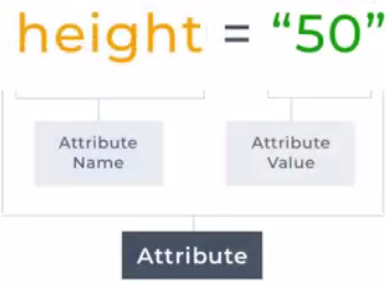
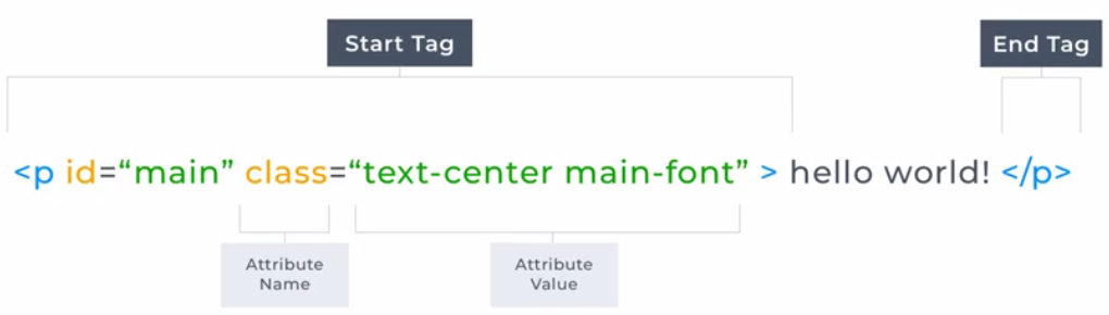
An attribute is made up of two parts: the name of the attribute is on the left, and the value of the attribute is on the right. Quotation marks surround the value of the attribute and an equal sign goes between the name of the attribute and its value.
We define attributes for a HTML element inside its opening HTML tag. They go after the name of the element and before the greater than sign that closes the opening tag.
A single HTML element can hold multiple attributes when you are defining more than one attribute. Each attribute name and value pair is separated with a space. If an attribute takes more than one value, then all the values for that attribute are wrapped in one pair of quotes and the values within it are separated with a space. This syntax and ordering of the code are essential so that the browser can read it and render what you're asking it to on the page. If something breaks in your code it's a good idea to check that you have the characters of your code in the right order and the spaces are where they need to be so that the program can read it. Tiny details matter a lot in code and with practice you'll become a pro at spotting the errors.
Each HTML element has specific attributes that will work with it; some HTML attributes must have particular attributes defined in order for them to work.
For example, an image element needs an attribute to tell it where to find the image file to display. During the following lessons, we will talk in detail about different HTML elements and their attributes. There's a lot to remember so I encourage you to make notes to help with your learning. Don't be afraid to Google specific elements and the attributes when you get stuck, even senior developers Google everyday. And practicing your researching skills is as important as learning the languages on this course.
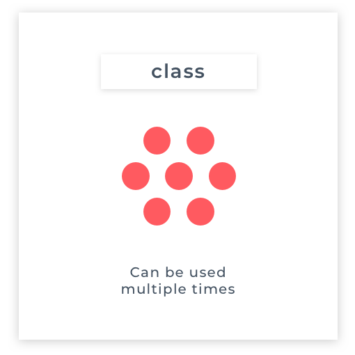
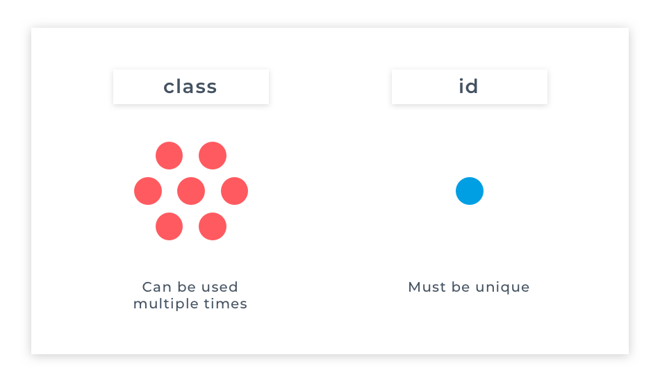
class is a widely used HTML element attribute.
A class attribute provides a common identifier to multiple elements. The class attribute is mostly used to point to a style in a style sheet. (we'll get to styles later in the CSS module).
The class attribute is a space-separated list of the classes assigned to an element. Classes allow CSS and JavaScript to select and access specific elements. It enables elements to be semantically grouped together, and similar styles or actions can then be applied to them. Multiple elements with the same class value can be treated as a group for collective styling.
id is a widely used HTML element attribute. The id attribute provides a unique identifier for an element within an html document. Use an id to target a single element on a page with styling or other functionality.
While classes are intended to be reused on the page, an id attribute value must be unique. There should be only one element with each id value. For example, a web page should not have two elements with an id="paragraph".
Like classes, id attribute values are used to identify specific html elements. Other languages like CSS and JavaScript then use the id to attach other properties or behaviours to that element.
While you are unlikely to see any errors from your HTML code if you accidentally use the same id twice, it will cause issues when other languages try to use the id value. When these languages target an element by its id, they will only access the first one they find in the HTML.
Another thing to remember is that unlike the class attribute, we can't add multiple id values to the same element. An element can have one id, and that id must be unique.
One of the core elements of the world wide web is the <a> (anchor), also known as a hyperlink. Hyperlinks enable you to link source HTML pages to various destination pages/images, sections within the same page or websites. You need to click the links created on the source pages to reach the destination. The links can be in the form of text, images, or website addresses. Remember that HTML stands for hypertext markup language. Hypertext implies that it contains hyperlinks. Hyper means that order is not linear. The order of the linking does not matter and it is not important which document is visited first.
The <a> element can be used to link to other web documents files or locations within the same page. HTML links are defined by an anchor tag. To make text into a link you put the text you want to be clicked inside the anchor element between its opening and closing tags. The anchor element can also be wrapped around other elements so you can turn images, text headings, and many other elements into clickable links as well.
By default, an anchor element will turn any text inside it blue and an underline will appear when the element is hovered over with a mouse.
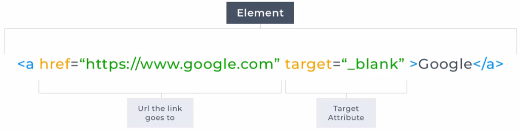
An anchor element must have a href attribute. HRef is short for Hypertext Reference and the value you give it is the location the user will be taken to when they click on the link. If the link you are providing in the href attribute is to a separate site, it is best practice to include the target attribute on your anchor element.
By default, the destination page always opens in the window of the source page itself. When you use the target attribute with its value set to "_blank", it changes the behavior of the link so that it opens in the new tab. Doing this means the user maintains a connection to the original website and they can open multiple links without having to use the browser back button to return to the source each time.
Each web page hyperlink is sensitive to three interactive states:
Style rules (see it later in CSS) can be used to emphasize each hyperlink state:
a:link { background:green;}
a:active { background:olive; }
a:hover { background:yellow;}
a:visited { background:aqua; }
<a href="https://stackoverflow.com" target="_blank" rel="help">Stack Overflow</a>
External links provide a link to another website page; this can be a link to another page on the same website or a link to another site. External links can also be used to download files.
Use the <a> element with a href attribute set to an external URL.
The target attribute on an anchor, when set to "_blank" ensures that the browser opens the link in a separate tab. It is essential to add target="_blank" when linking to a separate website from your own, as it prevents the user from being taken away from your website completely.
The rel attribute specifies the relationship between the current document and the linked document. Search engines may also use the information in the rel attribute to determine how to index or display the page. A rel attribute has many possible values, depending on the relationship that needs stating.
Common rel types are:
Take a look at this documentation for more information on rel types and their purposes.
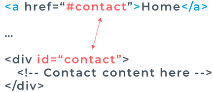
Internal links (bookmarks) provide a link to an element within the same page. When clicked on it, the view of the page moves so that the relevant section is at the top of the browser window.
Internal link syntax looks like this:
<a href="#next-section">Jump to section on the same page</a>
The href attribute value has a # at the beginning, and the rest of its value relates to an id attribute value on an element somewhere else on the page. This link above looks for an element like shown below, with the id of "next-section" on it to jump to.
<div id="next-section"></div>
A hyperlink can also target a specific point in a different document using the document’s URL, followed by a # hash character, then the fragment identifier. For example, the tag <a href="index.html#top"> targets an element within a document named index.html that contains the unique fragment identifier name of top.
You can nest links within other text elements.
<p>
Here's a <a href="https://codeinstitute.net/">link to codeinstitute.net</a> for you to follow.
</p>
Is displayed like this: Here's a link to codeinstitute.net for you to follow.
Sometimes you want to add elements to your website before you know where they will link. This is also handy when you're changing the behavior of a link using JavaScript, which we'll learn about later. Set the href attribute value to a #, also known as a hash symbol, to create a dead link. The # character will ensure when the link is clicked, the current page is simply reloaded.
<p>Click here to view more <a href="#" target="_blank">photo gallery</a>.</p>
There are three ways to access the target of a hyperlink:
A designated character key is specified for a hyperlink by the accesskey attribute of an <a> anchor tag. The method to utilize the designated key generally requires the user to press ALT + accesskey with most web browsers, such as Microsoft Edge and Google Chrome, but it’s ALT + SHIFT + accesskey with Firefox.
As in everyday life HTML lists are handy, they can be used for to-do's, recipes, navigational links, and so on. They allow you to structure and group relevant information in an easy to read format. The most commonly used list types are ordered lists and unordered lists.
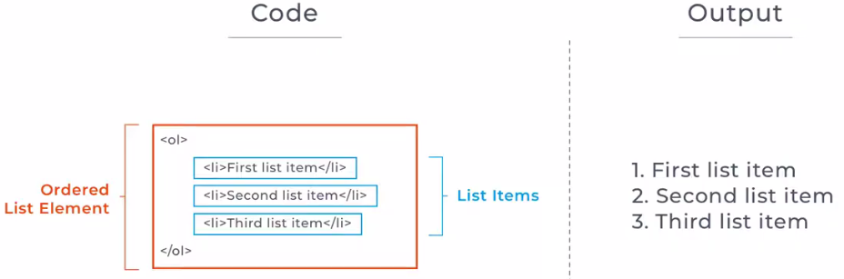
An ordered list is represented by the ol element. List item elements represented by the li element are nested one after another inside the ol element.
An ordered list is declared using the <ol> element, then each item in the list is defined using the <li> element, nested inside the <ol> element. Each list item contains a single item for the list, each displaying on its own line. By default, each list item will be numbered according to their appearance in the list. But you can override that by specifying character and roman numeral sequences using its type attribute. You can learn more about the different values you can apply to your ordered list in this documentation.
<ol type="A"> Alphabetically uppercase
<ol type="a"> Alphabetically lowercase
<ol type="I"> Order by roman numbers
An ordered list is used when the sequence of the list items is essential. It might reflect a sequence of steps to be carried out, or it might indicate some ranking of things. For example, when listing the steps in cooking a recipe.
You declare an unordered list using the <ul> element. Then just like with an ordered list, each item in the list is defined using the <li> element, nested inside the <ul> element.
By default, each list item will be displayed on a new line, with a bullet-point marker next to it. By default, the bullet point will be a solid circle. If the unordered list is nested inside another list, the bullet-point marker will change by default to reflect this. The type of bullet-point used can also be changed with CSS using the list-style-type property.
An unordered list is used when the sequence of the list items is not important. For example, a list of ingredients.
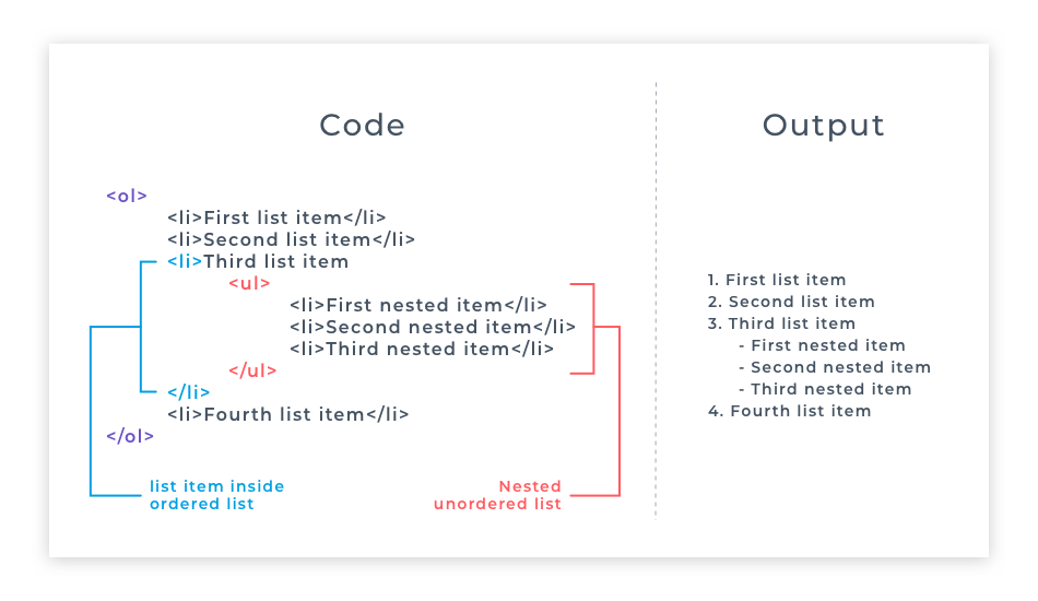
First of all - what is nesting? You have done lots of nesting of elements inside one another when writing your HTML code. The <body> is nested inside the <html> element, a <h1> is nested inside the <body> element etc. When nesting lists, we are simply nesting one list inside another one to create a sub-list.
Nesting lists are useful because nesting lists can create subcategories within a parent list item. Any type of list can be used for nesting.
A nested list should be wrapped in a list item. A nested list should relate to one specific list item, and one list item can have only one nested list. Take a look at the structure of the code in the example below.
A definition list is a unique type of list in which each list item has two parts – the first part being a term, and the second part being a description of the term in the first part. This is referred to as a name/value pair. For example, a definition name/value pair for the term “sun” could be “sun/the star at the center of our solar system”.
In HTML5, definition lists are created with <dl> </dl> tags, which provide a container for list items. Each list item term is contained between <dt> </dt> definition term tags, and each list item description is contained between <dd> </dd> definition description tags. The <dt> element alone does not indicate that its content is a term being defined – a nested <dfn> element must be used for that purpose. The <dfn> is used to indicate the term being defined within the context of a definition phrase or sentence.
Optionally, the </dt> and </dd> closing tags may be omitted – either form of <dt> and <dd> element is valid.
Each list item in a definition list can contain multiple <dt> and <dd> elements – to allow a single term to have multiple descriptions, or multiple terms to have a single description. Typically, browsers display the definition descriptions inset from their terms. Definition lists are also useful to contain a series of questions and related answers, or indeed any other groups of name/value data.
<dl>
<dt><dfn>Mouse</dfn></dt>
<dd class="grammar">noun</dd>
<dd class="spoken">[mous]</dd>
<dd>a small animal of various rodent families</dd>
<dd>a palm-sized button-operated device used to move a computer cursor</dd>
<dd>a quiet, timid person</dd>
</dl>
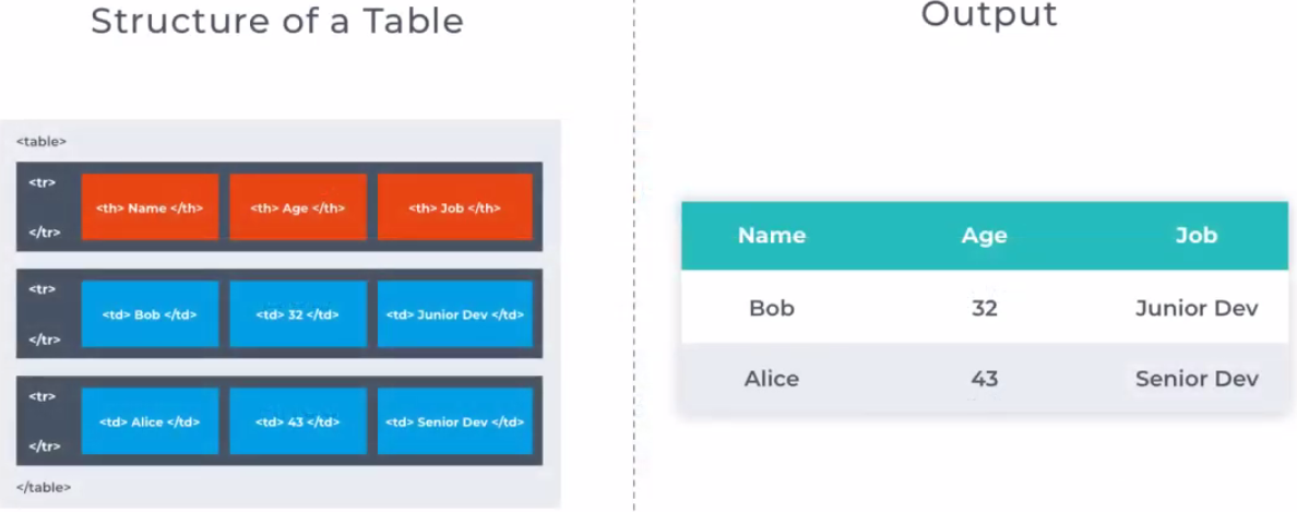
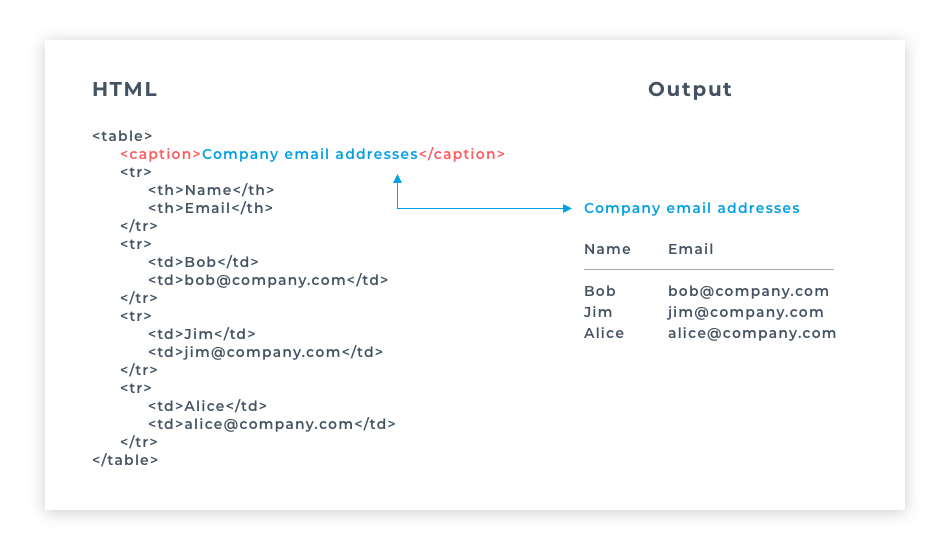
Tables are useful for structuring related information in an easily readable way. A table represents tabular data, that is information presented in a two-dimensional table composed of rows and columns of cells containing data. HTML tables are used to organize data or information in columns and rows. Tables can be used for anything from displaying Hospital patient data to cataloging Pokemon cards.
In HTML5, tables are created with <table> </table> tags, which provide a container for table rows. Each table row is created with <tr> </tr> tags, which provide a container for a line of table data cells. Each table data cell is created with <td> </td> tags, which enclose the actual data to be presented. Optionally, the </td> and </tr> closing tags may be omitted – either form of <td> and <tr> element is valid. A <table> element will typically contain numerous <tr> elements to create a table displaying multiple rows of data. Similarly, each <tr> element will typically contain numerous <td> elements to create a table of multiple columns of data. It is important to note, however, that each <tr> row in the table must contain the exact same number of <td> cells – so, for example, if the first <tr> row contains five <td> cells, all <tr> rows must contain five <td> cells.
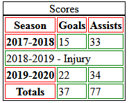
The <caption> tag defines a table caption. It must be inserted immediately after the <table> tag.
The <thead> tag is used to group header content in an HTML table. The <thead> element is used in conjunction with the <tbody> and <tfoot> elements to specify each part of a table (header, body, footer).
Browsers can use these elements to enable scrolling of the table body independently of the header and footer. Also, when printing a large table that spans multiple pages, these elements can enable the table header and footer to be printed at the top and bottom of each page.
<table>
<caption>Scores</caption>
<thead>
<tr> <th>Season</th> <th>Goals</th> <th>Assists</th> </tr>
</thead>
<tbody>
<tr> <th>2017-2018</th> <td>15</td> <td>33</td> </tr>
<tr>
<td colspan="3">2018-2019 - Injury</td>
</tr>
<tr> <th>2019-2020</th> <td>22</td> <td>34</td> </tr>
</tbody>
<tfoot>
<tr> <th>Totals</th> <td>37</td> <td>77</td> </tr>
</tfoot>
</table>
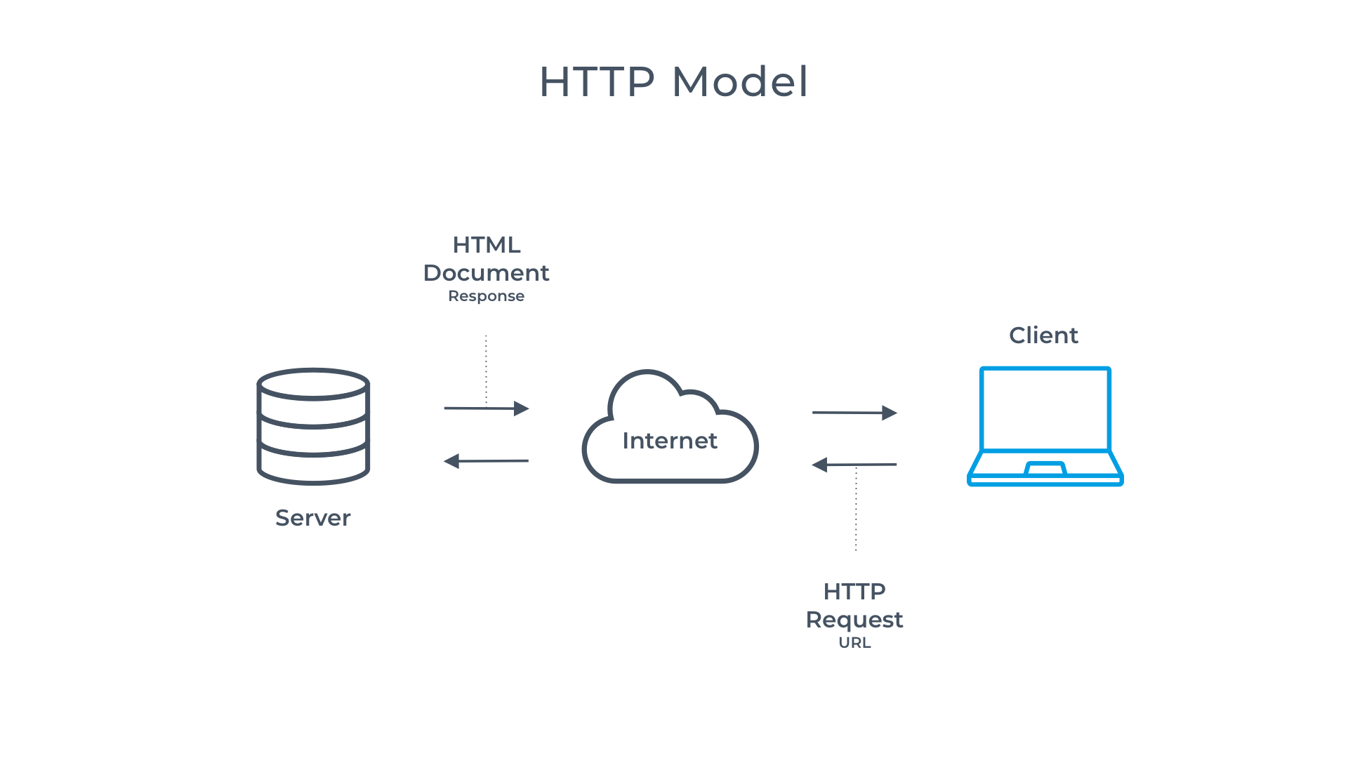
The HyperText Transfer Protocol (HTTP) is the spine of the web. It allows for sending and receiving data. The communication includes a request and a response.
In HTTP there are two different roles: server and client. The Web browser is the client that can send requests to the server, asking for the information. The server answers (responds to) the client, transmitting the requested data.
The most common response (for now) is in the form of an HTML document and its contents. HTTP has several methods: GET, PUT, POST, DELETE
https://www.codeinstitute.net/
You might have noticed the http:// used in web addresses. This part of the address, called protocol, tells the browser to communicate across the internet using HTTP. In the above example, you can see the address uses https:// the s stands for secure. Therefore communication with the server is secure.
In this section, we're going to introduce you to creating forms with HTML.
Forms are one of the main points of interaction between a user and a website. They allow users to input and submit data via text fields and other controls to a server for processing. Forms have many uses from login and registration to secure websites, collecting customer feedback, buying products online, or booking events. A form is used anytime submission of user information is needed. A form contains input elements where a user can enter information such as an email address or password. There can be single line or multi-line text fields, drop down menus, check boxes, radio buttons, and many other elements utilized to collect data.
So what happens to the data input into a form? The browser uses HTTP to make a request to the server with this data and then the server responds. HTTP stands for the HyperText Transfer Protocol. And it is the spine of the web, it allows for sending and receiving data. The communication includes a request and a response. In HTTP there are two different roles: server and client. The web browser is the client that can send requests to the server asking for information. The server answers the client with a response transmitting the requested data. The most common response is in the form of a HTML document and its contents. HTTP has several methods; since we're talking about forms we're going to focus on the GET and POST methods.
The GET http method is the most straightforward. It is used whenever the user clicks on a link or types an address into the browser address bar. In the context of a form, the GET method uses the input from the user to send a request back. For example, when a user fills in a login form the server responds if the login details are correct or not. The GET method does not modify the data on the server side, it just receives it as it is. In other words, the GET method is read-only; it does not affect the data in any way.
The POST http method tells the server to accept and store the data. It is often used for submitting a file or uploading a form to a database. When this feedback form is submitted the data is posted to the database to be saved. So it requires a POST method to work.
In short, GET requests data from the server and POST pushes data to the server. In order to wire up our HTML forms correctly so that data can be both requested and pushed, our form and input elements need several important attributes which we will cover in the coming lessons.
A <form> element contains other elements that make up the structure of the form. Those elements can be text fields (single line or multiline), select boxes, buttons, checkboxes, radio buttons and many other elements used to collect data. In the following units, we will work through many of these and explain their properties.
An example of a common element you will see nested inside a <form> is an <input> element. An <input> element is a self-closing element; it does not have a closing tag. It can be set to accept different types of input using its type attribute. We will discuss this in more detail in the coming units. For now, here is an example of an input element that will accept text input:
<input type="text">
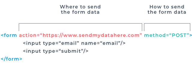
As the form element is for collecting data from the user, the form needs some important attributes to tell it where and how to send the data. To do this, we use the attributes action and method on the form element.
The value of the action attribute is the URL location of the data processing program to which the data will be sent or the next page to take us once the form is submitted..
The method attribute determines what type of HTTP method the form to take once it is submitted. Most common values:
<form method="POST" action="https://formdump.codeinstitute.net">
<input type="text"/>
<input type="submit"/>
</form>
As with all html attributes, the order that they are written in is not important. Most developers have a preference for the ordering they use, but there is no hard and fast rule for this. Therefore you will see occasions when a method attribute is defined before the action attribute on a form element, and vice versa.
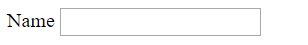
The <label> element is used to add context to input fields, by providing a label for them. A <label> element has a for attribute, the value of which corresponds to the id of it's related <input> element.
For example this code: produces this output:
<label for="name">Name</label>
<input id="name" type="text">
You might be wondering why a <label> element would need to be connected to its corresponding <input> in this way, as surely it is obvious when looking at the form that the label and input field go together.
The reason that they are connected within the code is so that the screen readers for visually impaired users are able to direct their users to what content belongs in which field.
As we have already discussed, an <input> is an HTML element where a user can enter data. <input> fields have several important attributes that they need to function correctly. We have discussed the type attribute, including how it affects the display and behaviour of the input field.
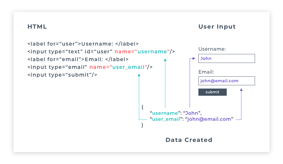
As well as a type attribute, each input field must also have a name attribute. The name attribute is essential for processing the data the user has sent. It provides a key with which to pair the data in the database. For example, if a user inputs the data "William Preston" into an input field with name="full_name" on it, the data would be stored in the database as { "full_name" : "William Preston" }.
You will learn a lot more about storing and accessing data in the later modules of the course. The critical thing to remember for now is that without the name attribute, data from <input> can't be processed. It will not be sent when submitting the form.
An <input> field can have a placeholder attribute. The value set to the placeholder displays hint text before a user starts entering data into the field. When a user starts typing, the placeholder text will disappear.
An <input> field can also have a value attribute. This attribute specifies the initial value of the input field. This value will not disappear when a user starts typing, but they can delete and replace it if they want to. The value attribute is useful to pre-populate a form with existing data. When a value attribute is used on an input field with type="submit" the value given to the value attribute replaces the default "Submit" text on the button.
The <input> element can be one of many different types, depending on the value you give its type attribute. Each of these types collects a different type of data to store in a database. While many forms work correctly using text and password fields along with a submit button, you may at times need more sophisticated means of getting form input from your site users. Free text can be error-prone; typos are common. If you can help a user provide data in a way that is intuitive and reduces the risk of error, you will improve the user experience and minimise the risk of bad data being submitted. It can also control what the user is permitted to submit. Many of the input types listed below prohibit submission of the form if the user enters a value that is not permitted, and issue an error notice. Some also provide special controls that allow the user to easily select a permitted value.
Here are a few controls that can make life easier for you and more enjoyable for your users:
Take a look at this documentation for a full list of input types.
<input> elements can optionally include other attributes to control their performance:
It's important to make sure that features can be used across as many browsers as possible. To do this, visit the Can I Use? website. Type the feature into the search box, and it will display a list of compatible browsers and exceptions. For example, the search input type only appears with an X symbol on specific browsers and is a regular text input field on others. It's important to know what features are cross-browser compatible, especially if they are a significant part of your project.
A <textarea> is useful when you need to give the user an area to enter a more substantial amount of text than a simple <input type="text"> field provides. For example, in a contact form, a <textarea> would be used for writing the central part of the message.
Unlike the <input> element, the <textarea> element does have a closing tag. When you want to pre-populate your <textarea> with data, you put this between the opening and closing tags, instead of using a value attribute like you do for a <input type="text"> element.
The <textarea> element has two additional attributes: rows and cols. These attributes are used to set its size on the screen using numerical values.
The value given to rows sets the height of the text area, and the value given to cols sets the width.
Like the previous input types we have discussed, the <textarea> also needs values for name and id attributes, and its <label> element should have a matching for attribute for its id.
The <textarea> element can also take a placeholder attribute for hint text to be displayed in the text window before the user starts typing.
<label for="ta">Example textarea</label>
<textarea id="ta" name="comment" rows="10" columns="50" maxlength="250">
Some enclosed text as default content.
</textarea>
Optionally, it may also include a readonly attribute to prevent the user editing its content. – as its enclosed content is treated as its value.
An important thing to note, unlike a text <input> element, the <textarea> element has no value attribute, anything you put between the opening and closing textarea tags will be interpreted as values typed into the textarea field. So if you accidentally put a space between them, the browser will interpret this as a space entered into the textarea. This will cause any placeholder text you provided not to show.
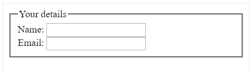
HTML5 introduced new form elements that help organise content on the web page. One of them is <fieldset> which groups related elements by drawing a box around any elements nested inside it.
The <fieldset> element is usually followed by a <legend> element, which defines a title for the <fieldset> element. The legend content is displayed inside the top line of the fieldset border.
<fieldset>
<legend>Your details</legend>
<label>Name:<input type="text"></label><br>
<label>Email:<input type="email"></label>
</fieldset>
Checkboxes allow a user to choose multiple options from a list of options. They are input fields with the type attribute of checkbox.
<label for="accept_terms">Accept terms</label>
<input id="accept_terms" type="checkbox" name="accept_terms" value="yes" checked>
By default, the data sent to the server from a checkbox that is checked is the value of on. If you give the checkbox a value attribute, the value you give this attribute is the value that will be sent to the server.
In the example above, we've got a name attribute with the value of accept_terms, and a value attribute with the value of yes. When this is submitted, the data name/value pair sent to the server would be
{ "accept_terms" : "yes" }.
If the value attribute was omitted, the default value for the checkbox is on; the submitted data would be
{ "accept_terms" : "on" }.
A checkbox input element can have a checked attribute. This attribute does not need to fit the usual attribute_name="attribute_value" syntax. Simply adding checked inside the input element's opening tag is enough to make it work, as demonstrated in the example above. When a checkbox input has a checked attribute, the checkbox will be pre-checked when the form is loaded in the browser.
A checkbox input element needs a corresponding <label> element, so the user knows what the checkbox is for. When using a <label> with a checkbox, if you want the checkbox to appear to the left of the label, you will need to define the checkbox input element first and the label second. Each of your checkboxes can be nested within its own label element. By wrapping an input element inside of a label element it will automatically associate the checkbox input with the label element surrounding it.
All related checkbox inputs should have the same name attribute. Multiple checkboxes that share a common name can be visually grouped by surrounding their <input> elements by <fieldset> element. These may also contain <legend> element to state a common group name.
Here's an example of a preselected checkbox and a checkbox group:
<form>
<label>Yes, I would like to receive details <input type="checkbox" name="requestdetails" checked></label>
<fieldset>
<legend>Activities of Interest...</legend>
<label>Sailing <input type="checkbox" name="Do" value="Sail"></label><br>
<label>Walking <input type="checkbox" name="Do" value="Walk"></label><br>
<label>Driving <input type="checkbox" name="Do" value="Drive"></label><br>
<label>Ski-ing <input type="checkbox" name="Do" value="Ski"></label><br>
<label>Jogging <input type="checkbox" name="Do" value="Jog"></label><br>
</fieldset>
</form>
Radio buttons take their name from old-fashioned radios where if you pushed in one button the other buttons would pop out, allowing only one button to be pressed at any one time.
Radio buttons allow a user to choose only one option from a set of related options known as a radio group.
<input type="radio" name="payment_type" value="creditcard" checked>
<input type="radio" name="payment_type" value="paypal">
A radio group is defined by giving each of radio buttons in the group a name attribute with the same value. Once a radio group is established, selecting any radio button in that group automatically deselects any currently-selected radio button in the same group.
When a radio input has a checked attribute, the radio button will be pre-selected when the form is loaded in the browser.
Radio buttons also need a value attribute, the value of which is the data that is sent to the server. Only the selected radio button’s name/value data will be sent to the server:
{ "payment_type" : "creditcard" }.
When a button is selected, its switch is set to on and its name/value pair will be submitted, otherwise its switch is set to off and its name/value pair is not submitted. Unlike checkboxes, radio buttons that share a common name are mutually exclusive, so when one radio button is selected, all others in that group are automatically switched off.
Like a checkbox, an input field with a radio type attribute needs a corresponding label element, and if you want the radio button to be to the left of the label, it should be created first in the code.
Suppose there is a long list of related options available to a user. In that case, it is better from a User Experience and User Interface (UX/UI) point of view to use a dropdown list than using checkboxes or radio buttons. It is easier to comprehend one self-contained dropdown list than many checkboxes. A dropdown list takes up very little real-estate on the page until it's temporarily in focus (active). Dropdowns are also useful for mobile devices.
<form>
<label for="found">How did you hear about us?</label>
<select id="found" name="found">
<optgroup label="Media">
<option value="tv">TV</option>
<option value="radio">Web</option>
<option value="other">Other</option>
</optgroup>
<optgroup label="Web">
<option value="google">Google</option>
<option value="bing">Bing</option>
</optgroup>
</select>
</form>
You create a dropdown list with predefined options to choose from by using the <select> element. A select element must have a name attribute so that the data has an identifier to send to the database with the value selected.
The dropdown list with predefined options for the user to choose from contains one or more <option> elements. Each option contains a single choice for selection.
The <option> element displays the option text to be displayed and an optional value attribute that can act as a unique identifier for that option. If present, this value attribute will be sent to the server when the form is submitted. If the value attribute is missing, then the value will be taken from the text content of the option element.
An <option> element can have a Boolean attribute called selected. Like the checked attribute, this attribute does not conform to the usual attribute_name="attribute_value" syntax of most attributes. An option element with a selected attribute will be pre-selected and displayed by default when the page is loaded.
When an option has a selected attribute, it looks like this:
<option value="option value" selected>Option text</option>.
Optionally, the <option> elements may be grouped by enclosure in <optgroup> </optgroup> tags. The opening <optgroup> tag may specify an option group name via a label attribute.
A select option list will normally appear as a single-line dropdown list, unless a size attribute is included in the <select> tag to specify the number of rows to be visible.
A simple “autocomplete” feature can be provided for a text <input> using a <datalist> </datalist> element to enclose a number of predefined <option> values. The user may choose any one of the options, or type their own value into the input field directly.
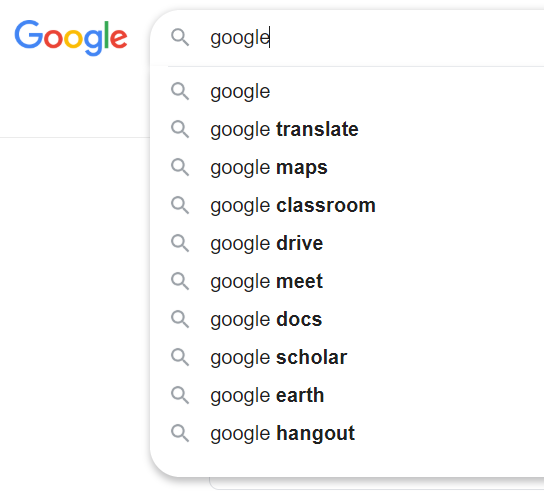
A good example of when you will have seen this kind of functionality is in the search bar on Google. As soon as you start typing, Google starts suggesting things that might fit your search.
While not as complicated as google search, your datalist can provide a list of possible options that the user might select. The list can be seen right away when the input field is selected, and the list of options will change to autocomplete whatever the user is typing in, should any option from the datalist match the user input.
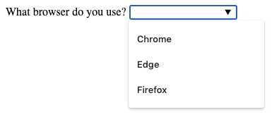
<form>
<datalist id="browsers">
<option value="chrome" >Chrome</option>
<option value="edge" >Edge</option>
<option value="firefox">Firefox</option>
</datalist>
<label for="browser">What browser do you use?</label>
<input type="text" id="browser" name="brower" list="browsers">
</form>
A datalist element must have an id. And this id value is then set to match a list attribute on an <input> field. The name attribute for your data goes on the <input> element. The value for each option is set using the value attribute on the <option>.
A form button is used primarily to submit the form data to the server. There are two types of elements that can do this:
An <input type="submit" value="SendInput"> element will create a submit button with the text of "SendInput" on it.
A <button type="submit" value="SendInput">SendButton</button> element will do exactly the same thing.
The difference between these two elements is that because a <button type="submit"> element has a closing tag, you can put other elements inside it, like spans, images or icons, for example. Whereas an <input type="submit"> button can only hold plain text as it's value.
Another type of form button attribute is the type="reset". This attribute can be applied to either an <input> or <button> element, and when clicked will reset the form to its original values when the page was first loaded.
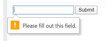
Sometimes we need to prevent a user from submitting empty input fields. For example, we do not want to allow a user to sign up for a site if he/she did not enter an email or password. We need to validate these input fields. In other words, we need to make sure that they are not empty when submitting the form. We can achieve this with the required attribute. When it is applied, the user will be prompted to fill in all the required fields before they can submit the form.
The required attribute is another attribute that does not conform to the standard attribute_name="attribute_value" syntax, simply adding required to the input element's opening tag is enough to make that field required, like this:
<input type="email" required>
Adding a required attribute to the input field with the type="email" makes sure that field is not empty and that an invalid format of an email address cannot be submitted. It means that addresses without @ sign or the dot will not be submitted.
The required attribute can be added to any form input element: <input>, <textarea> and <select> can all have the required attribute applied. When applying the required attribute to <input type="radio">, the required attribute only needs to be applied to one of the input fields with the same name attribute on them. Then the form will be accepted when one radio option has been selected.
<form oninput="fn.value = firstname.value + ' ' + surname.value">
<input type="text" name="firstname">
<input type="text" name="surname">
<output name="fn"></output>
</form>
Within the <form> element use the following attributes to make form fields more accessible for those who can not use a mouse for navigation.
<form>
<input type="text" name="firstname" accesskey="f" tabindex="1">
<input type="text" name="surname" accesskey="s" tabindex="2">
<input type="email" name="email" accesskey="e" tabindex="3">
<button type="submit">Submit</button>
</form>
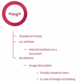
We already talked about the <img> element back when we were first introducing you to attributes. But let's go back over some of the details now you are more familiar with HTML syntax.
The <img> element is a self-closing element, meaning it cannot have other content nested inside it, and it has no closing tag.
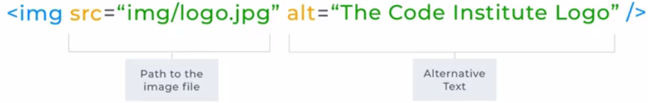
<img src="daisys.png" alt="A close up photograph of daisys"/>
As you may remember from the attributes unit, the <img> element takes two important attributes: The src attribute, which takes the file path to the image file to be displayed. And the alt attribute for text to be displayed if the image file does not load, and to describe the image on screen readers for visually impaired users.
The <img> element can also take height and width attributes to control its size. Though it is worth bearing in mind, it is better practice to use CSS to control height and width properties..
By adding the title attribute to the <img> tag, the displayed picture gets a tooltip when the cursor hovers over it:
<img src="HTML5_Logo_64.png"
alt="HTML5 Logo"
title="HTML5 Logo">
Additional Perspectives From People We Like
“A picture is worth a thousand words”. When creating a web application, it can be hard to find images to illustrate your site. Some stock image websites have free downloadable images for websites. One of these is Pexels. When you download one of their images, you have an option to copy a link to it. Always use this link, for example in the alt attribute, as attribution for the image.
Sites you can source Free Stock Photography:
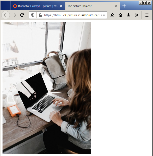
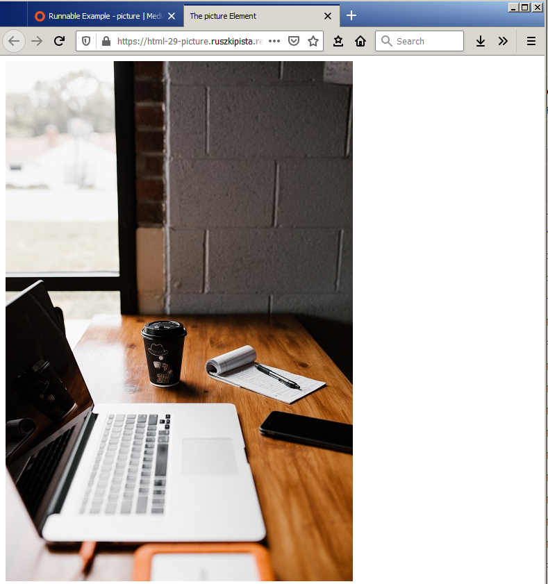
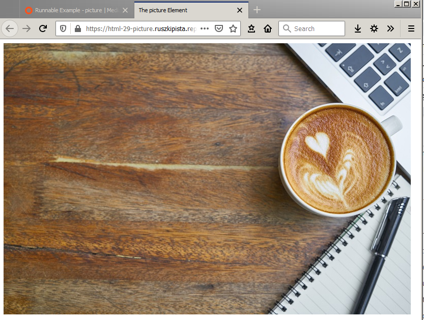
The <picture> element gives more flexibility to set image resources in your projects, as you can use it to set different images to be shown depending on the width of the browser viewport. By using the picture element, you can display different images to the user depending on the screen size they are viewing your webpage on. This is part of what is known as responsive design - changing how your website looks for mobile, tablet or desktop size screens.
The most common use of the <picture> element would be for art direction in responsive designs. Instead of having an image that is scaled up or down based on the width of the browser window, multiple images can be designed to fit nicely into the width of the screen.
<picture>
<source srcset="desk-small.jpg" media="(max-width:600px)">
<source srcset="desk-portrait.jpg" media="(max-width:800px)">
<img src="desk-landscape.jpg" alt="laptop, notepad and a mug on a wooden desk">
</picture>
The <picture> element holds two different elements: One or more <source> elements, and one <img> element.
When used with the <picture> element, the <source> element needs two important attributes: srcset, which defines the URL of the image to show. And media which accepts a media query.
Media queries are used in responsive design to control what can be seen on different screen sizes. A wide landscape photograph looks great on a laptop screen. However, the same size image on a phone screen would need the user to scroll sideways, and they would not be able to see the whole image all at once.
For a <source> element, the media attribute value follows this syntax: media="(max-width: 600px)" this means "apply this source image when the browser viewport has a width of 600 pixels or less". So, if your screen size were more than 600px wide, the image attached to this media query would not be shown. You will learn more about media queries in the CSS module.
The source element is a self-closing element; it does not need a closing tag.
The <img> element is required as the last child element of the <picture> element. The <img> element is used to provide backward compatibility for browsers that do not support the <picture> element, or if none of the <source> elements media queries are active.
The <audio> element is used to embed sound content into a web page.
The source of the audio file is defined using the src attribute on the audio element. The <audio> element can take several other attributes depending on the behaviour you want it to have. If the controls attribute is included the browser will give the user controls for audio playback, including volume and pause. The loop attribute will set the audio file to start over each time it is finished. And the muted attribute specifies if the audio file should be muted when the file is first loaded.
The autoplay attribute, when set, will automatically play the audio on page load. However, it is considered a bad user experience to autoplay audio or video that has sound on it. Some browsers - including Chrome - will block audio files from playing automatically until the user interacts with the page.
All of these attributes can be added to the audio element without a value being attached. for example:
<audio src="myAudio.mp3" controls muted loop>
Browsers don't all support the same file types for audio, so if you want to be sure your audio file will play on all of them you can provide multiple sources inside nested <source> elements, and the browser will use the first one that it finds compatible.
When nested inside an <audio> element, the <source> element takes two attributes: The src attribute, which defines the path to the audio file, and type, which defines the type of audio file. The value for the type attribute here is either audio/mpeg or audio/ogg.
You can read more about multiple audio sources in this documentation.
An <audio> element can also contain a <track> element. This element is used to reference timed text tracks (or time-based data), for example, to handle displaying subtitles automatically.
You can read more about the track element in this documentation.
As the <audio> element was introduced with HTML5, some browsers do not support it, but you can leave a message between the <audio> </audio> tags to be displayed to users of these browsers. You can put any html elements between your audio element tags; common choices are paragraph, anchor or heading elements for a text-based message. However, you could add an image, button or any other relevant content that makes sense to display to a user who can't access the audio element with their browser.
<video src="myVideo.mp4" width="500" autoplay muted loop>
The <video> element is used to embed video content into a web page. The source of the video file is defined using the src attribute on the video element.
Like the audio element, the <video> element can take several other attributes, depending on the behaviour you want it to have:
It is considered a bad user experience to autoplay a video that has sound on it. So if you use the autoplay property, it is also recommended to use the muted attribute, so the video is silent.
All of these attributes can be added to the video element without a value being attached (see example above).
Browsers don't all support the same file types for video, so if you want to be sure your video file will play on all of them you can provide multiple sources inside nested <source> elements, and the browser will use the first one that it finds compatible.
When nested inside a <video> element, the <source> element takes two attributes: The src attribute, which defines the path to the video file. And the type attribute, which defines the type of video file. The value for the type attribute here is either video/webm, video/mp4 or video/ogg. You can read more about multiple video sources in this documentation.
As the <video> element was introduced with HTML5, some browsers do not support it. You can leave a message between the <video> </video> tags to be displayed to users of these browsers.
Inline Frames can be particularly useful when embedding videos from another source or creating a sidebar with search capabilities.
An <iframe> element embeds another web document within the current document. It displays a web page within a web page. It adds the content of the new page while keeping the content of the current document unchanged. Lots of websites have embedded Google maps or YouTube videos. Those are all examples of iframes. In fact, the live code editors that you have been using throughout this course are embedded using iframes.
The inline frame’s dimensions must be specified to the <iframe> element’s width and height attributes, and the URL of the external resource to its src attribute. Where the dimensions of the external resource exceed those of the inline frame, the browser automatically adds scroll bars so the user can view the entire content.
Each <iframe> element may also optionally contain a name attribute to specify a unique identifier for that frame. This allows hyperlinks to then load the URL specified to their href attribute into the inline frame (rather than replace the entire page) by assigning the frame name to a target attribute in the <a> element. For example, a hyperlink could target an inline frame named topbox with <a href="some.html" target="topbox">. Typically, inline frames are useful to provide supplemental content while maintaining a compact page format.
Some very old browsers do not support iframes. It is good practice to add a message to be displayed to users when the iframe will not load. This message goes between the opening and closing iframe tags like this:
<iframe src="https://www.wikipedia.org/" width="400">
<p>Your browser does not support iframes.</p>
</iframe>
The word semantics in the English language means the study of the meanings of different words.
In 2001, Tim berners-lee and others wrote a Scientific American article called the Semantic Web. In the article they described Semantic Web as
“an extension of the current web in which information is given well-defined meaning, better enabling computers and people to work in cooperation”.
Now this description boils down to the aim of generating information that is easily understood by a computer as it is by a human.
The original goal of Tim's web was people-to-people communication. People sharing knowledge and collaborating with each other in the form of web documents. Computers just acted as the content generation, transport, and display mechanisms for this communication. The computers had no understanding of the meaning or purpose contained within these documents. Tim then, conceived of a second communication goal. This involved extending the collaboration to computers. And to do this, the computers would have to infer meaning from the content.
Now we've mentioned the word semantic once or twice in earlier videos. But let's take a closer look at its meaning here. Semantics is related to syntax. Syntax describes how you say something and semantics describes the meaning behind what was said.
The original set of HTML tags were very generic in terms of semantics. For example, a paragraph tag describes a generic block of text but nothing really beyond that. As a human you could infer the meaning of the content by reading the paragraph in the context of any other paragraphs on the page or maybe the page title and any images present. The browser and search engines and other applications can't easily do that. Search engines can look for keywords on a page to try and glean some meaning, but the keywords found may not reflect the main purpose of the page. Those words might be located in a page footer or sidebar and be unrelated to the main content of the page. In other words, while the syntax may be clear the semantics may not be.
There are various HTML elements that do not convey any meaning to the web browser and developer. Such elements are known as non-semantic elements. These include elements such as <div>, <span>, and so on.
The latest incarnation of HTML is called HTML5 and HTML5 attempts to address the absence of semantic clarity in older HTML elements. In doing so, introduces semantic elements. These elements clearly describe their meaning to developers and browsers. By the way, HTML doesn't do away with the older elements. It just introduces additional elements to supplement and add context to the older elements meaning. Now here's a list of the more common semantic elements.
The aside element is also available. Now when used within an article element the contents of an aside should be specifically related to the article, for example, a glossary. But when an aside is used outside of an article element the contents should be related to the entire site, maybe a Twitter feed, groups of additional navigation, and even advertising, if the content is related to that page.
The footer element works very much in the same way as the header element, but in addition to navigation elements, a footer typically contains information about its section as to who wrote it, links to related documents, copyright data, and alike.
We also have the nav element, as you might imagine the nav element represents a location on a page that links to other pages or parts within a page. It's like a section for navigation links. Note though, that not all groups of links on a page need to be in a nav element, only sections that consist of major navigation blocks are appropriate for the nav element.
The main element helps to define the main content in a page. The content included within the main element must not be repeated, and there cannot be multiple main elements in a single page. The entire content of the article, aside, details elements are included within the main element.
There are many other semantic elements introduced in HTML 5 and also semantic elements that have been around for quite a while such as the table and form elements. But why should you care about these elements? First of all, the semantic elements increase the accessibility of your content. That is they provide more meaning to screen readers used by visually impaired users. Most government based project contracts require a high level of accessibility on their sites and web applications. Search engines also like semantic markup, it's easier to find you. Google no longer bases its search criteria on keywords alone, it bases them on intent. Semantic elements highlight your intent so using them goes a long way to perfecting your search engine optimization.
The <header> element provides introductory content to a web page.
.
When nested inside the <body> element, it is the masthead for the web page, positioned near the top of the page and containing key information like the main heading <h1>, a tag line or introductory paragraph describing what the page is about. A <header> can also contain the navigation for the page.
A page can have multiple <header> tags, e.g. inside each <article> elements.
The <nav> element represents a location on a page that links to other pages or parts within the same page. Common examples of navigation sections are menus, tables of contents, and indexes.
A <nav> element is typically found near the top of every web page on a site because this is where the user expects it to be.
A web page can contain several <nav> elements. For example, one for site navigation and one for navigation of elements on the same page. Use of more than one nav element on the page is usually only necessary in complex websites with large amounts of information to structure.
Note though that not all groups of links on a page need to be in a nav element - Only sections that consist of major navigation blocks are appropriate for the <nav> element. For example, a <footer> may contain a list of links that don't need to be in a <nav> element.
The <footer> element represents a footer for its nearest section of content.
You are used to seeing footers at the bottom of most web pages, containing information about the author of the website, copyright data or links to related documents.
A <footer> can also be used inside an <article> element.
The <section> element is used for a section of content when there isn't a more specific semantic element to represent it.
Typically a <section> will include a heading element, but this is not mandatory. We should not use the <section> element as a generic container for styling purposes only, in this case, we would use a <div>. A rule of thumb is that a section should logically appear in the flow of a document. If you were to write an index for the content of your page, a section would represent one of the things in the index of content. For example, a section should be a 'section' of a <main>, <footer> or <header> etc, rather than just a division of space.
The <article> element is used for any self-contained sections within a web page, which can be independent of the other content. For example, a news article, blog or forum post.
A web page can have multiple <article> elements within it. An <article> can contain a <header> and <footer>, and one or more <section> elements.
Each article should be identified with a heading element <h1> - <h6> as a child of the article element.
When an <article> element is nested, the inner element represents an article related to the outer element. For example, the comments of a blog post can be inside an <article> element.
<article class="series_review">
<header>
<h1>Back to the Future</h1>
</header>
<section class="main_review">
<h2>Main review</h2>
<p>Great Scott, we loved it!</p>
</section>
<section class="user_reviews">
<h3>User Reviews</h3>
<article class="user_review">
<p>Kids and parents alike are
gonna dig this wonderful fantasy.</p>
<footer>
<p>Posted by Mike</p>
</footer>
</article>
<article class="user_review">
<p>There isn't a wasted scene.</p>
<footer>
<p>Posted by Derek</p>
</footer>
</article>
<article class="user_review">
<p>Every bit as classy, clever and
cockle-warming as it was 30 years ago.</p>
<footer>
<p>Posted by Maria</p>
</footer>
</article>
</section>
</article>
Take a look at the example. Styling has been added to show how the different elements are nested inside each other. The <section> elements are outlined in orange, and the <article> elements in green. The <footer> elements have a grey background.
The <aside> element is used for a portion of a document where its content is indirectly related to the document's main content.
The <aside> element is often used as a sidebar or call-out box. It does not, however, have any associated styling. The semantic meaning is just content that is only tangentially related to the web page content. It might be content that enhances the main content but is not critical to its understanding. However, a web search engine will now be aware that the aside text is an interesting snippet of information but not an integral part of the surroundings.
<article>
<header>
<h1>Flying Ford Anglia Mystifies Muggles</h1>
</header>
<section>
<p>
Bewildered, two Muggles at London were convinced they saw an old car flying over the Post Office tower at noon in Norfolk. Mrs Hetty Bayliss spotted the Flying Ford Anglia while hanging out her washing in her locality of Watford. Mr Angus Fleet of Peebles reported the flying car to police at his local Finchley station. Six or seven Muggles in all reported the Flying Ford Anglia. The Improper Use of Magic Office is investigating the incident.
</p>
<aside>
<p>This article appeared in The Evening Profit on 1 September, 1992</p>
</aside>
</section>
<footer>
<p>Andy Smudgley - The Daily Profit</p>
</footer>
</article>
<figure>
<img src="happydog.jpg" alt="Happy dog"/>
<figcaption>Happy dogs are good dogs</figcaption>
</figure>
</figure>
Usually, the <figure> element contains an image-based component such as an illustration, diagram, graph, table or code snippet. The content of a figure element is referenced in the main flow of a document. However, it can be moved to another part of the document or an appendix, without causing the flow of information to be affected. Therefore the content of the figure should be self-contained.
You might be wondering, why would we use a <figure> element when we already know how to use <img>? What is the difference between these two elements? From a visual perspective, there is no difference. Still, on a semantic level, the difference between the figure and the image element is pretty simple: We use the image element to embed the image in an HTML document whereas we use the figure tag to semantically organize the content of an image in the HTML document. By placing an image file into a figure element, you are telling the browser and search engines that the content of the figure could be seen on its own, separate from the rest of the content of the page, and still make sense.
The figure element can contain an optional caption, using the <figcaption> element, which is also nested inside the <figure> element. You would use a <figure> where an image is not just decorative but is referred to in an article.
The <caption> element is used to provide a caption for a <table>.
A <caption> element should be the first child of its parent element <table>.
If you have a <figure> containing only a <table>, then use the <figcaption> element instead of the <caption>.
The <details> element creates a widget in which information is only visible when the widget is clicked on.
A summary or label for the widget is provided by using a <summary> element nested inside the <details> element.
The widget usually has a small triangle which points sideways or down to indicate its open or closed status.
A <details> element is closed by default, and might look something like the image below with only the text inside the <summary> element visible:
When a user clicks the details element, the rest of the content inside it is made visible, and the triangle indicator changes to point down, like this:
The <blockquote> tag specifies a section that is quoted from another source. Browsers usually indent <blockquote> elements.
<p>Here is a quote from WWF's website:</p>
<blockquote cite="http://www.worldwildlife.org/who/index.html">
For 50 years, WWF has been protecting the future of nature. The world's leading conservation organization, WWF works in 100 countries and is supported by 1.2 million members in the United States and close to 5 million globally.
</blockquote>
The <q> tag defines a short quotation. Browsers normally insert quotation marks around the quotation.
<p>WWF's goal is to: <q>Build a future where people live in harmony with nature.</q> We hope they succeed.</p>
Accessibility in code is about making sure that anyone can understand your website regardless of auditory, visual or physical dis-abilities. Much of the content we have already covered in this module has included elements and attributes that provide accessibility for disabled users. Let's take a look through some of these topics again from an accessibility point of view.
Semantic HTML not only helps browsers to understand the context of our content but it also helps with the accessibility for users with impairments. This is because these elements often provide additional functionality for screen readers or operation by keyboard only rather than by mouse. For example, a clickable button element can be navigated to using the tab key on the keyboard and selected to using the enter key. One of the best ways to help a screen reader make sense of text content on the page is to use the appropriate HTML structure for your text elements. Good semantic text structure includes headings, paragraphs, lists, and the like. A screen reader will then have the indicators it needs to read out the content in a useful way. A screen reader reads each header out as it progresses through the content telling the user what the type of each piece of content is. A screen reader can bring up a list of all headings to search through and many have the functionality to jump forward and back through the headings in a document. We've also discussed semantic structural elements such as header, nav, article, section, etc., at length. Their presence in your code provides screen readers with important information that can be conveyed to their users.
User interface controls also known as UI controls are parts of the web that the user interacts with typically buttons, links, and form controls. An important aspect of accessibility of UI controls is that by default browsers allow them to be accessed using a keyboard, by clicking the tab key to jump from one UI control to another.
Back in the form elements section of this module, we discussed the importance of connecting input elements to their corresponding label elements via their respective id and for attributes. The key reason for this is so that screen readers can clearly label input fields for their users.
Accessibility is a large subject when you dig deeper into it. It covers not only HTML, but also CSS and JavaScript as well. As we are in the HTML module we have a set of HTML attributes to introduce you to that will help improve accessibility called ARIA attributes. ARIA stands for Accessible Rich Internet Applications and is a set of attributes that define ways to make web content and web applications more accessible to people with disabilities. To keep the design and content of a web page clean, much important detail about content often assumes the user can infer it from visual context. As a result, the use of icons for links to relevant social media platforms, or to operate interactive parts of a web page are every day. For a user who cannot see the icons, they are useless. Links with text content that do not make sense on their own also cause problems; the user is left guessing as to its purpose much of the time. Links that open in a separate tab without informing a screen reader user can be confusing too.
Fortunately, ARIA attributes can be used to help label and group these elements together so that a user relying on a screen reader can gain the same value and understanding from your website as anyone else.
To provide information about what your links, icons and interactive elements are for, and further detail about how they behave, the aria-label attribute can be applied to them. The value for an aria-label is a string of text that labels the purpose and behaviour of the element. For example:
<a href="https://twitter.com/CodersInstitute"
aria-label="Go to our twitter page (opens in new tab)"
target="_blank">Twitter</a>
For images, we have already talked about using the alt attribute on an <img> element, to describe the image. Without an alt attribute, a screen reader will read out the name of the image file that is being loaded, which is rarely descriptive enough.
Suppose you use a background-image with css, and the image is an integral part of the information you are providing to the user. In that case, an aria-label attribute should be added to the element to describe the image. The reason for this is that a background image is not applied using an img element, so there would be no alt attribute available to it in this case.
The aria-labelledby attribute establishes relationships between objects and their labels. The value given to the aria-labelledby attribute should be one or more element IDs, which refer to elements that have the text needed for labelling.
Screen readers use this attribute to catalogue the objects in a document so that users can navigate between them. Without an element ID, the assistive technology cannot catalog the object.
The reason for this is to provide names for regions of a page that can be read by assistive technology. The aria-labelledby attribute associates a section of the page marked up as a region or landmarks with text that is on the page. The landmarks help assistive technology users orient themselves to a page and help them navigate easily to various sections of a page. For example:
<div aria-labelledby="heading-one heading-two">
<h1 id="heading-one">First heading</h1>
<p>Paragraph text here...</p>
<h2 id="heading-two">Second heading</h2>
<p>More paragraph text here...</p>
</div>
The aria-labelledby attribute also works to label image-based elements in the same way as the for attribute works to label an input element.
When a project has a photograph, illustration, animation, diagram or another visual component within it, the same page may also contain a text description of this element. When this is the case, the aria-labelledby attribute can be used to identify that these two elements - the visual media and the text description - go together.
The value of the aria-labelledby attribute corresponds directly to the value of the id for the element or elements that describe it.
If you can use the aria-labelledby attribute on an <img> element, its alt attribute should be an empty value. For example:
<img src="diagram.png" alt="" aria-labelledby="diagram-description conclusion">
<p id="diagram-description">The diagram above shows ...</p>
<p id="conclusion">We can draw the following conclusions ...</p>
It is not necessary to use aria-label if aria-labelledby can be used. If both are included, screen readers will always give precedence to aria-labelledby.
Metadata is simply data that describes other data. In the context of HTML, document meta data describes the document itself – rather than the document’s contents.
We use the charset metadata type to define the character encoding of a webpage.
<meta charset="UTF-8">
When we use the <meta> element to define the character encoding of a website, it takes a charset attribute. The value given to the charset attribute is usually UTF-8, which is the character encoding for Unicode. Unicode is a 16-bit character set designed to cover all the world's major languages, and as such should cover most of your needs as a developer.
To see all the available character encodings, take a look at this documentation.
Forgetting to include the charset metadata in a basic website often won't cause any apparent issues, as modern browsers will scan the content and make a guess as to the charset to use if this metadata is not provided. However, if you use special characters in your project like ↑→↓←, without the charset metadata, the characters may render looking like this: ↑→↓↠if the browser being used is old. Similar issues can occur when using non-standard alphabet characters, so it is best practice to include this metadata on every web page.
Descriptive <meta> tags always have a name attribute, to specify a page feature, and a content attribute to specify that feature’s value.
<head>
<meta charset="UTF-8">
<meta name="viewport" content="width=device-width, initial-scale=1.0">
<meta name="description" content="Change your life by learning code in as little as 16 Weeks with a Diploma in Software Development. With over 100 international hiring partners.">
<meta name="keywords" content="css, html, javascript, python, flask, django, sql, full stack web developer, course, bootcamp">
<meta name="author" content="Code Institute">
<meta name="robots" content="index, follow">
<meta name="google" content="notranslate">
<title>Code Institute | Full Stack Software Development Diploma</title>
</head>
The viewport metadata type is used to define the viewport - the user's visible area of the web page. This area varies depending on the device, being smaller on a mobile than on a computer screen. This is how the metadata for your viewport should be set on all web pages:
<meta name="viewport" content="with=device-width, initial-scale=1.0">
The name attribute defines the type of data the meta tag contains, in this case, that is viewport. The content attribute defines the data.
Within the data provided, the with=device-width part sets the width of the page to follow the screen width of the device - which will vary depending on the device. The initial-scale=1.0 part sets the initial zoom level when the browser first loads the page. View on a mobile screen
without the viewport meta tag: with the viewport meta tag:
The final three metadata types that we will cover in this lesson are description, keywords and author.
These data types are primarily used by websites that access other websites. For example, When you post a link to a website on social media, the details of the link are rendered on most social media platforms with a page title and description. The short description of the link rendered on the social media platform comes from the description metadata in the head of the page.
Google looks into the title, description, keywords and author of a website when searching for possible matches to google searches, and it will display the title and description information in its search results. So if you want a webpage to be found by Google, it is important to set these values in your metadata for SEO.
<title>Code Institute | Full Stack Software Development Diploma</title>
<meta name="description" content="Change your life by learning code in as little as 16 Weeks with a Diploma in Software Development. 88% of graduates are hired within 6 month of completion">
<meta name="keywords" content="css, html, javascript, python, flask, django, sql, full stack web developer, course, bootcamp">
<meta name="author" content="Code Institute">
In the example above, the type of metadata is set using the name attribute, and the value for each is set using the content attribute. For the keywords, each keyword or key phrase should be separated with a comma.
It is important to note that the metadata in the head of your page is not the only thing needed for good SEO. Making sure your content is clear and that you have used appropriate semantic HTML elements is also important.
Reload the page after a number of seconds specified. This technique is often used on websites to dynamically update news or status items, as it does not depend on JavaScript support.
<meta http-equiv="refresh" content="5">
Another popular use redirects the browser to a new web page after a specified number of seconds, like this:
<meta http-equiv="refresh" content="5 ; url=’new-page.html’">
When you have set your viewport metadata correctly, the preview output will look like this in the devtools device toolbar:
Characters or symbols such as the less than sign < or greater than sign > are known as reserved characters in HTML. You cannot directly use these reserved characters in HTML codes because the browser may interpret them as tags. Therefore, in order to use such reserved characters in HTML codes, you must include character entities. Apart from the reserved characters, you can use character entities in HTML codes to represent currency, mathematical, or technical symbols that are not there on your keyboard.
Character entities are also known as HTML entities. Each entity is identified with a name and number. Entity names are case sensitive. The syntax to write a character entity is as follows: &entity_name; or &#entity_number;
The following table lists some of the commonly used character entities in HTML codes:
Result | Description | Entity Name | Entity Number |
| non-breaking space | |   |
< | less than | < | < |
> | greater than | > | > |
& | ampersand | & | & |
" | double quotation mark | " | " |
' | single quotation mark (apostrophe) | ' | ' |
¢ | cent | ¢ | ¢ |
£ | pound | £ | £ |
€ | euro | € | € |
© | copyright | © | © |
® | registered | ® | ® |
™ | trade mark | ™ |
For example this code:
<p>Tel ☎ +353 1 539 7973</p>
<p>© Code Institute 2020</p>
displayed like this:
Tel ☎ +353 1 539 7973
© Code Institute 2020
HTML5 provides four phrasing elements that can be used to emphasize text within the body of a document:
It is perhaps surprising that the <b> and <i> tags remain in HTML5, as they outwardly suggest that content should be presented in a bold or italic font – contradicting the aim of HTML5 to separate structure from presentation. According to the specifications, their meaning has been redefined, however, so content within a <b> element should be “stylistically offset” and that within an <i> element should be seen as in an “alternate voice”. In real terms, these are nonetheless represented by bold and italic fonts but should only be used as a last resort as they do not convey meaning – use <strong> and <em> tags instead. The <b> tag should be avoided wherever possible, but one legitimate use is to markup the lead sentence of an article.
<p><strong>Warning.</strong> This <mark>dungeon is dangerous</mark>. <strong>Avoid the ducks.</strong> Take any gold you find. <strong>Do not take any of the diamonds, they are explosive.</strong> You have been warned.</p>
<p><em>Puppy dogs</em> are cute.</p>
<p>Puppy dogs <em>are</em> cute.</p>
<p>Puppy dogs are <em>cute.</em></p>
<p>Microsoft Surface Pro 4 <wbr>- 128GB / Intel Core i5</p>
<p><s>$999</s> $799</p>
<p>Memory: <mark>4GB</mark><br>Screen: <mark>12.3-inch</mark></p>
<p>Surface <u>Pen</u> Included</p>
HTML5 provides three elements that can be used to format text within the body of a document:
<p>Example Corp today announced record profits for the second quarter <small>(Full Disclosure: EG News is a subsidiary of Example Corp)</small>, leading to speculation about a merger with Demo Group.</p>
<h1>To Do List</h1>
<p>Empty the dishwasher</p>
<del><p>Take out the trash</p></del>
<ins><p>Sweep the yard</p></ins>
<ins><p>Feed the <del>dog</del><ins> cat</ins></p></ins>
The <noscript> tag defines an alternate content to be displayed to users that have disabled scripts in their browser or have a browser that doesn't support script. The <noscript> element can be used in both <head> and <body>. When used inside <head>, the <noscript> element could only contain <link>, <style>, and <meta> elements.
<body>
<script language="JavaScript">
alert('This browser supports JavaScript')
</script>
<noscript>
This browser does not support JavaScript!
</noscript>
</body>
How to test the noscript tag: With the Firefox web browser, enter about:config in its address bar, then accept the “risk” warning and click the javascript:enabled item to false – to disable JavaScript support.